Summer Church Signs: What Are The Best Sayings And Ideas For The Season?

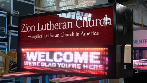
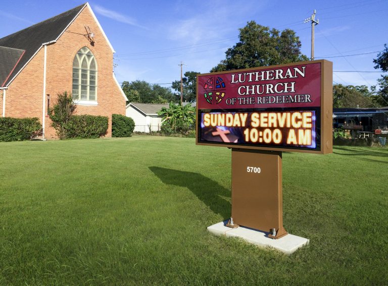
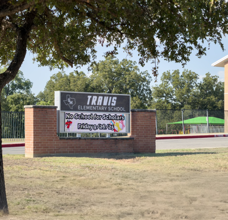
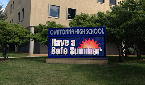
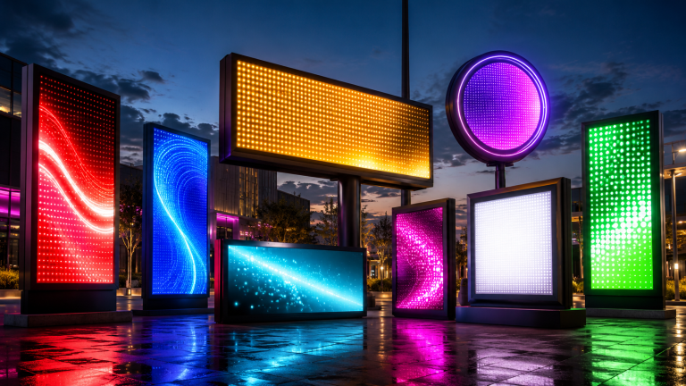
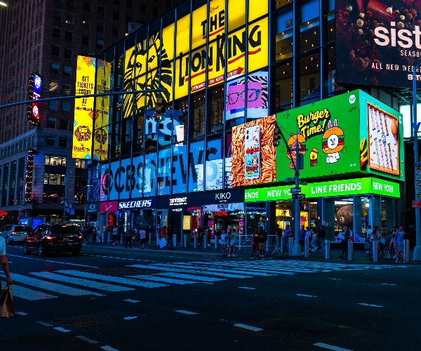
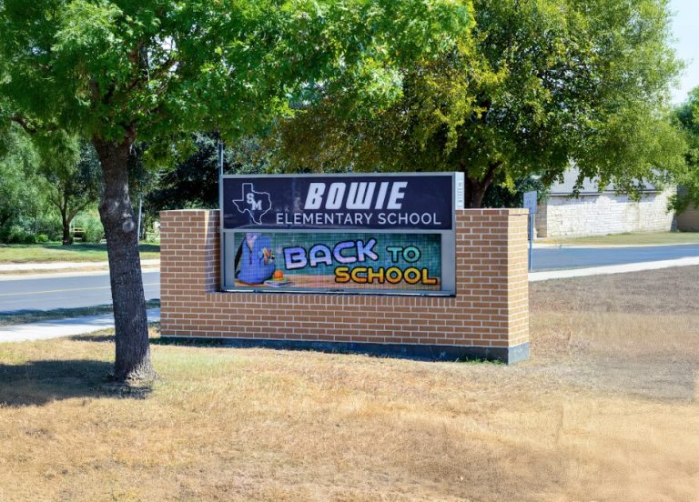
Alpha LED sign boards are great for anything from churches, to schools, to business. They tend to do great in large open spaces, where they are clearly visible.

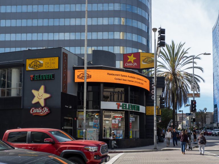
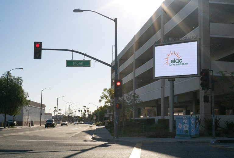
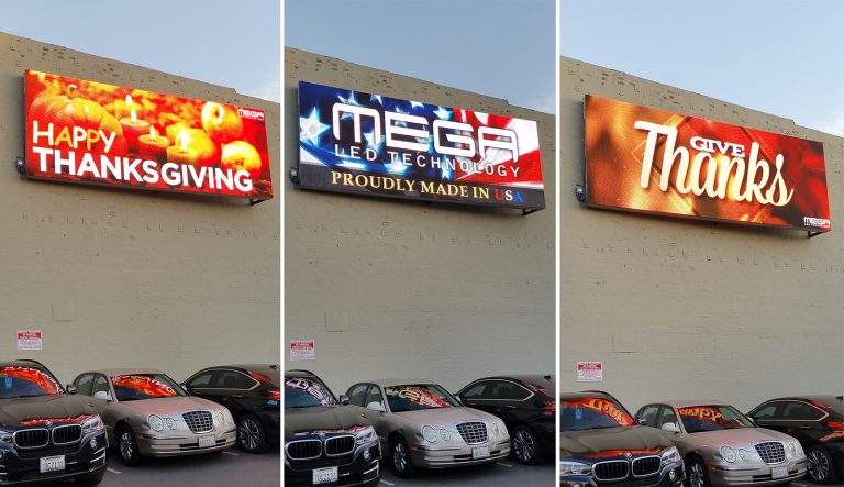
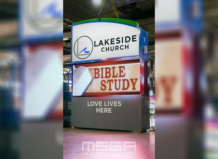
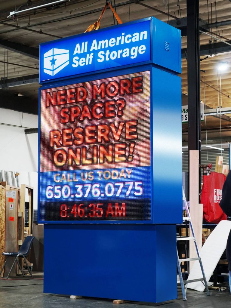
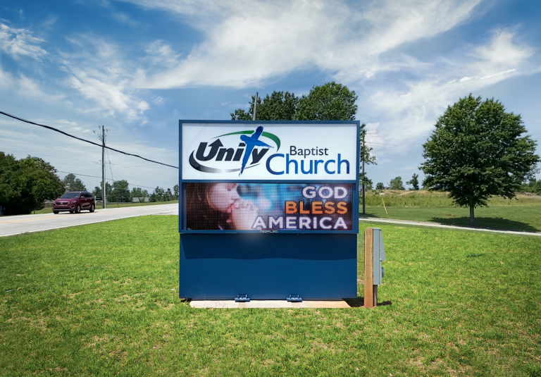
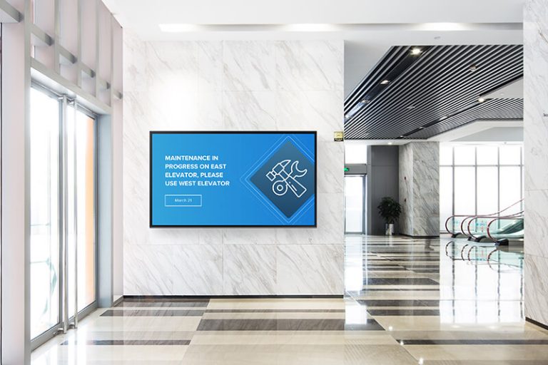
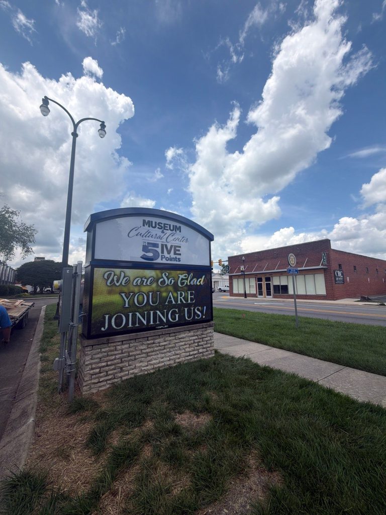
Omega is our newest line of outdoor digital signs. Running the full gambit from cabinet, to LED sign, to logo on top, or any configuration of your choice!

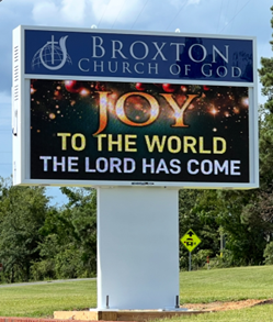
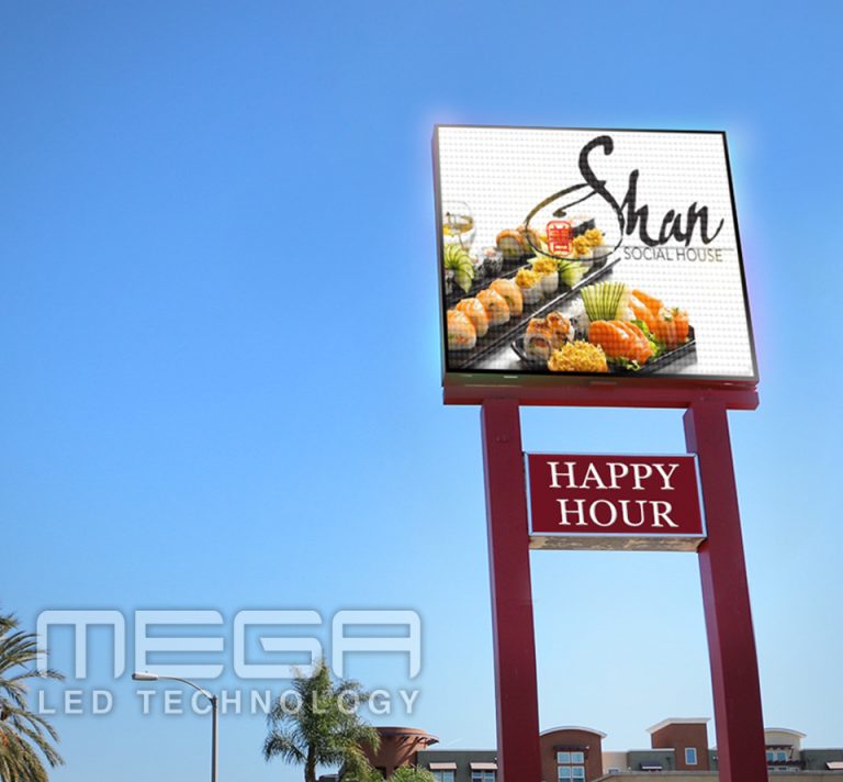
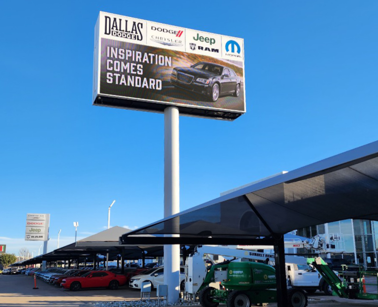
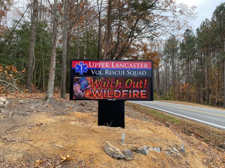
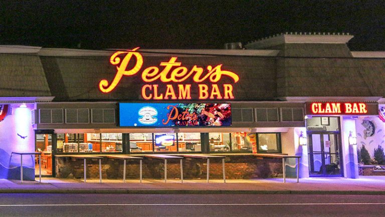
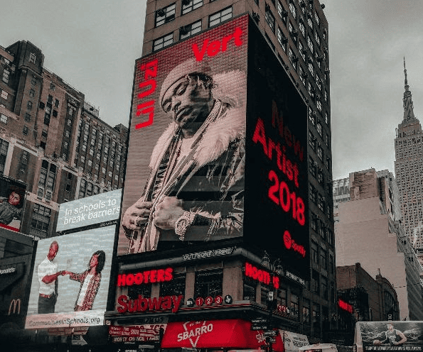
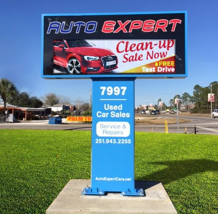
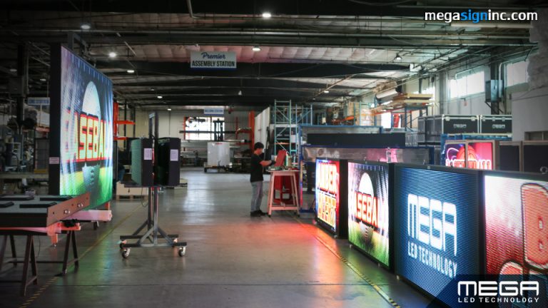
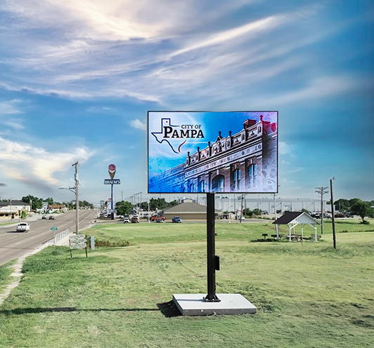
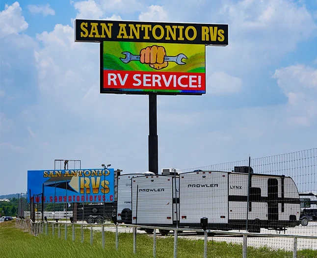
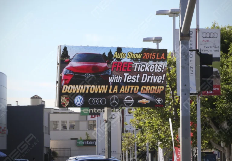
Premier is a customizable Outdoor LED sign, perfect for the Entrepreneur who knows that large custom sized signs cultivated for their specific business is the way to go.

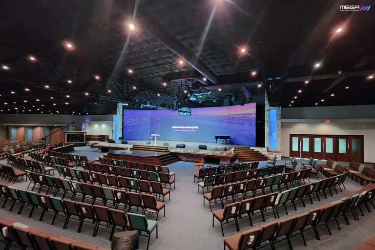
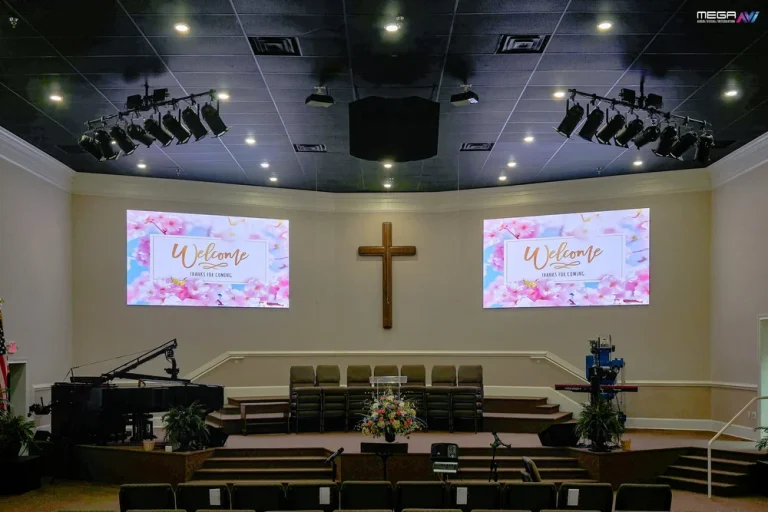
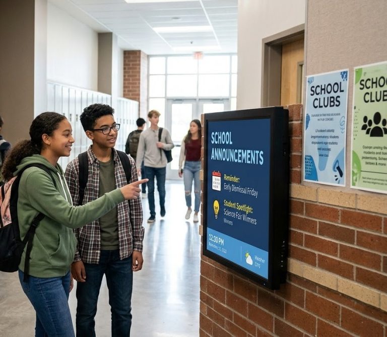
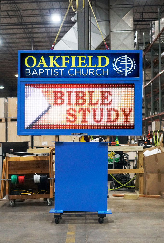
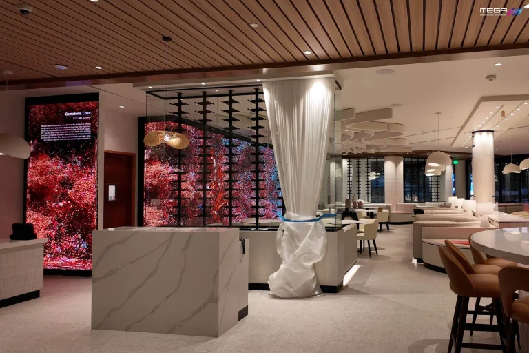
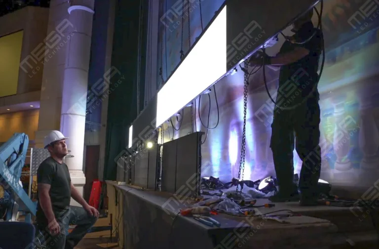
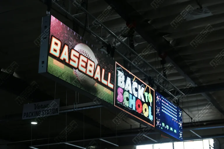
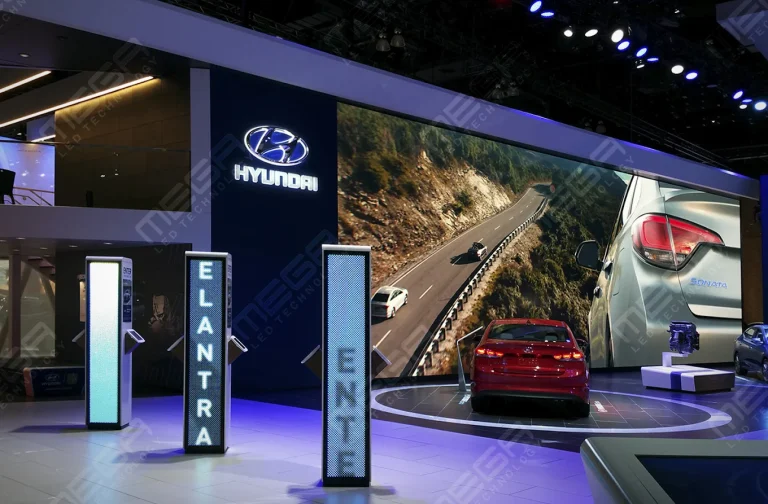
Programmable Stage LED signs, great for indoor assemblies, congregations, and presentations! Blow your competitors out of the water, or keep your congregation and audience glued to your message.

Alpha LED sign boards are great for anything from churches, to schools, to business. They tend to do great in large open spaces, where they are clearly visible.
Omega is our newest line of outdoor digital signs. Running the full gambit from cabinet, to LED sign, to logo on top, or any configuration of your choice!
Premier is a customizable Outdoor LED sign, perfect for the Entrepreneur who knows that large custom sized signs cultivated for their specific business is the way to go.
Programmable Stage LED signs, great for indoor assemblies, congregations, and presentations! Blow your competitors out of the water, or keep your congregation and audience glued to your message.
Most retail signage ideas start at the front door, which skips the sign that decides whether anyone reaches the door. Miss that one and a clever window display gets no audience. We build signs for both spots, so this guide starts at the street.

Retail signage is five jobs, not five products: exterior signs earn the turn-in, window signs convert the person walking past, directional signs get people to the right shelf, promotional signs move one item, and digital signs change any of them without a printer.
A coordinated set beats one strong sign. When the road sign, the window, and the aisle headers name things the same way, a shopper stops re-learning your store. Your layout and customers decide which job gets funded first, so do not start with the sign you like most. Start with the point where customers are dropping out. A store that drivers cannot identify has a different problem from one where shoppers enter but cannot find what they need.
| If this is your problem | Start with this sign | What it should do | What to measure |
|---|---|---|---|
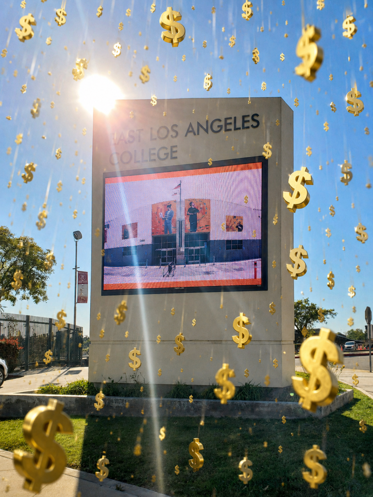
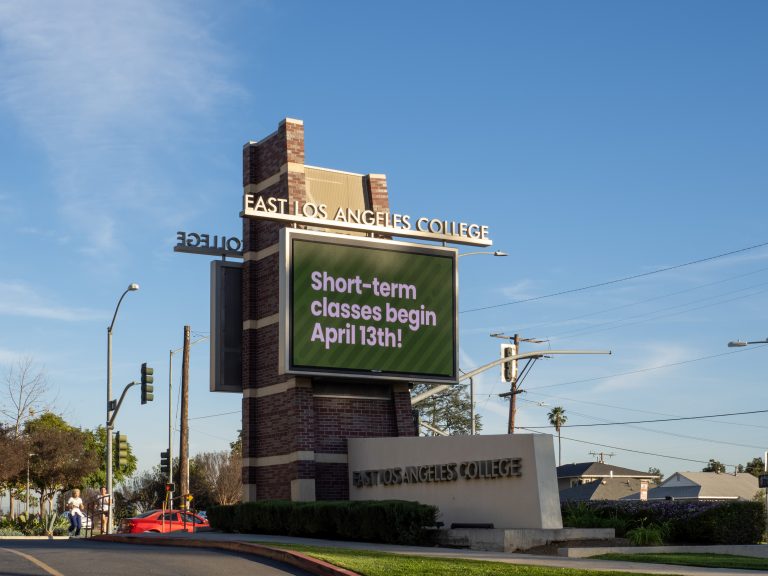
| Drivers pass without noticing the store | Road-facing pole or monument sign | Make the business identifiable early enough to turn in | Store visits, turn-ins, direction requests |
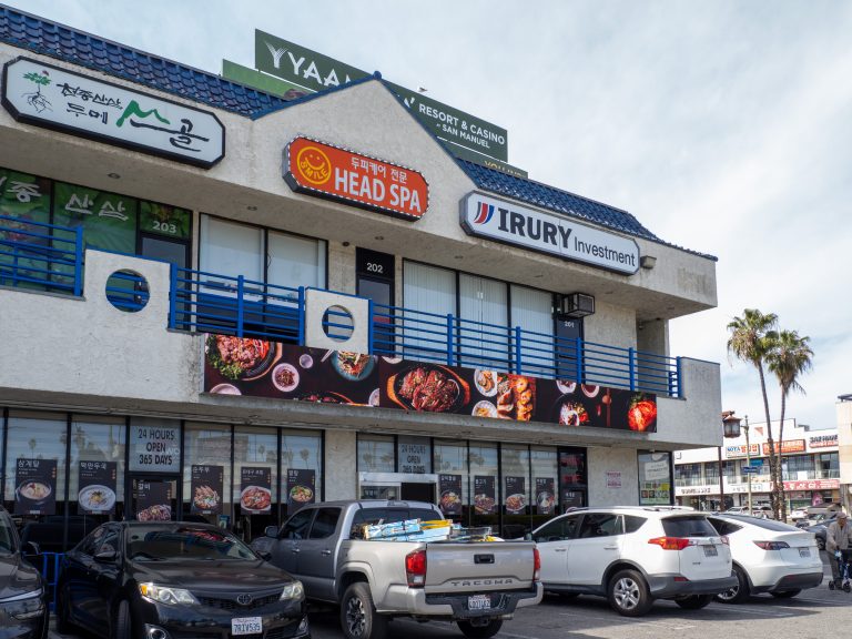
| People notice the store but walk past | Storefront/window sign | Give passersby a clear reason to enter now | Entry rate, offer redemptions, QR scans |
| Customers regularly ask where products are | Aisle, department and wayfinding signs | Help shoppers navigate without staff assistance | Direction questions, time spent searching |
| A product or category gets overlooked | Point-of-purchase or promotional sign | Put the benefit, offer or comparison beside the decision | Units sold, category revenue, attach rate |
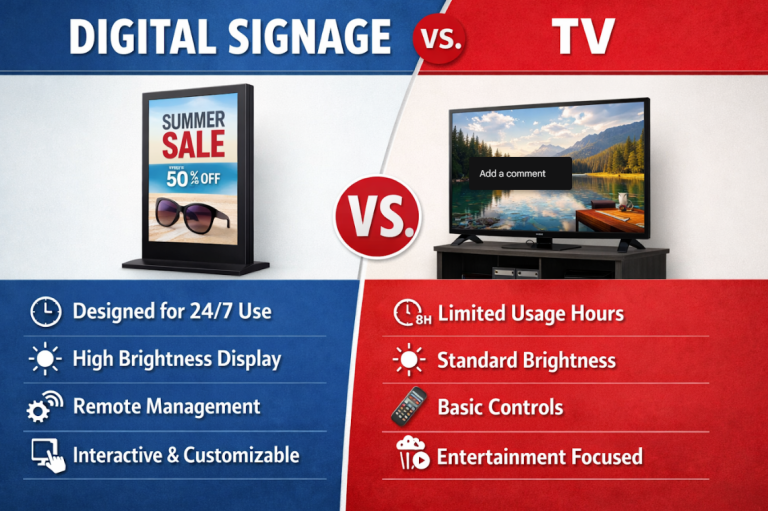
| Prices, offers or information change frequently | Digital signage | Update messages without repeatedly printing new signs | Campaign response, update time, promoted-item sales |
The principle is simple: fix the earliest broken step first. There is little value optimizing an aisle promotion if potential customers cannot identify the store from the road.

Content sells when it removes a reason not to buy. A screen looping your logo removes nothing. A screen answering “does this fit my car?” removes the reason someone walks out to check their phone.
Grand View Research’s digital signage market report puts the global market at USD 31.1 billion in 2025 and names retail the largest application segment.
Split your loop four ways: an offer, a how-to, something worth watching, and a direction. Four we would run tomorrow are a live countdown on a deadline offer, a before and after of a service you sell, the answer to your most-asked staff question, and the maker’s name on whatever sits by the register.
Distinctive, decorative, and readable beats both.
The United States Small Business Administration’s Office of Advocacy counted 34.8 million small businesses in its November 2024 small business profiles release, so your shopper has walked past a lot of storefronts this week.
Give them something countable or something true. A running tally board (“1,482 loaves since January”) gets photographed, and so does a sign measuring in your own units, like rope sold in dog lengths. Handwrite one line a day inside a fixed frame while everything else stays typeset, and people start checking that frame.
One rule sits under all of it. If a stranger cannot read it from where they stand, it is decoration.
Tell us your street and setback, plus the budget you have in mind. We come back with a sign size and a price that fits the spot.
Outdoor signs answer three questions: does this place exist, is it open, and is there a reason to stop today. Most stores answer the first and skip the rest.
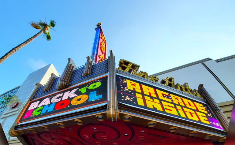
The audience is real. The Out of Home Advertising Association of America’s April 2023 OOH retail research with Morning Consult found 68% of shoppers notice out-of-home ads on the way to a retailer. Ideas that earn it: a two-message loop pairing what you are known for with today’s reason to stop, a closing-time swap so nobody pulls into a dark lot, and a turn cue if you sit back off the road.
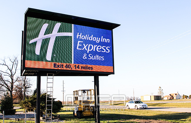
Spec follows the street. Choose 6mm or 8mm SMD for sharp reading up close and from the road, which is what we quote for a store on a normal street. On highway frontage, 16mm DIP and Discrete LEDs carry the long read.
We are a veteran-owned manufacturer in Grand Prairie, Texas, so our high-visibility outdoor signs stay competitively priced: you buy from the people who build them. In the retail installs we do, we’ve found the blocker is rarely budget. It is the permit, which takes weeks, so file early.
For a window instead of a pole, our scrolling window signs run off a standard outlet. Pole and monument work sits with Premier outdoor LED.
Interior signs should reduce questions, not add noise. A store with signs on every surface reads like a store with none.
Build a small system and repeat it. Number aisles at both ends so the shopper coming from the back is not lost, use the words customers say rather than your point-of-sale category names, and hang one blade sign per aisle at head height so it reads down the run.
Keep projecting signs legally. The United States Access Board’s protruding objects guidance explains that wall-mounted objects with leading edges between 27 and 80 inches cannot project more than 4 inches into a circulation path.
Add one direction cue from the deepest corner to checkout and restrooms, and leave it there.
A queue is the only place in retail where people will read. Shoppers there are stationary and mildly bored, and they have already committed to buying.
Size the content to the wait. Store owners tell us the message that calms a line fastest is the honest one: name the wait (“about four minutes from here”) instead of pretending there is no line.
Post the return policy where the line stops rather than at the counter, put payment options in view so cards come out early, then place the loyalty sign-up at elbow height. A two-minute wait supports one message. A ten-minute service wait supports a short rotation.
Our VERSA scrolling signs mount in a window or hang from the ceiling, and they run off a standard outlet. You program them from a wireless keyboard across the room.
Content follows how often people buy and how long they stay. A grocery shopper visits weekly and decides in seconds. A car buyer visits twice a year and sits for an hour.
That gap changes message length and where the screen goes. Borrow the thinking below rather than the exact loop. Our digital signs guide covers the sign formats we build, from scrolling window signs to outdoor monument signs.
Grocery content wins on speed and timing. Weekly offers, a fresh-item callout, and aisle numbers do the work, because the shopper is already moving with a list.
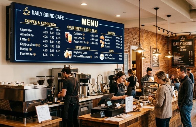
Tie the loop to the clock: coffee and breakfast before 10, hot bar at noon, dinner solutions after 4. Screens near the fresh counters are the cheapest place to run price changes, since a digital price beats reprinting shelf cards twice a week.
Cross-sell in pairs the shopper can reach. Name the sauce that goes with the pasta two feet away, and put loyalty balances where people queue.
Liquor store screens work hardest as a comparison tool. Shoppers face a wall of unfamiliar labels, and content explaining the difference between two categories sells more than a discount graphic.
Run featured bottles and new releases, add simple pairing ideas, and then keep one responsible-service message in the rotation.
Advertising rules here are stricter than in general retail. Alcohol beverage advertising is regulated federally under the alcohol advertising rules administered by the Alcohol and Tobacco Tax and Trade Bureau, and your state alcoholic beverage control board adds its own rules on signage and age messaging. Check both before the content goes live.
Automotive screens sell what is not on the lot. A large display can show a trim or color you did not stock, which turns “we do not have it” into an order.
Give the showroom three things: a model showcase with real specs, a finance panel with plain payment ranges, and a comparison of the two trims people confuse. The service waiting area is separate because that customer sits for 45 minutes. Run maintenance intervals and the package nobody thinks to ask about.
A Premier outdoor LED sign puts a readable, changeable message in front of every car that passes your lot. We handle the permit and the install.
Malls run two content streams: mall-wide and tenant-paid. Keep them visually separate so a shopper knows whether they are reading the property or an advertiser.
Directories and wayfinding come first, then event calendars, then tenant promotions sold as ad slots. Reserve an override for emergency and closure messaging, since a mall screen is a public-safety asset on the wrong day.
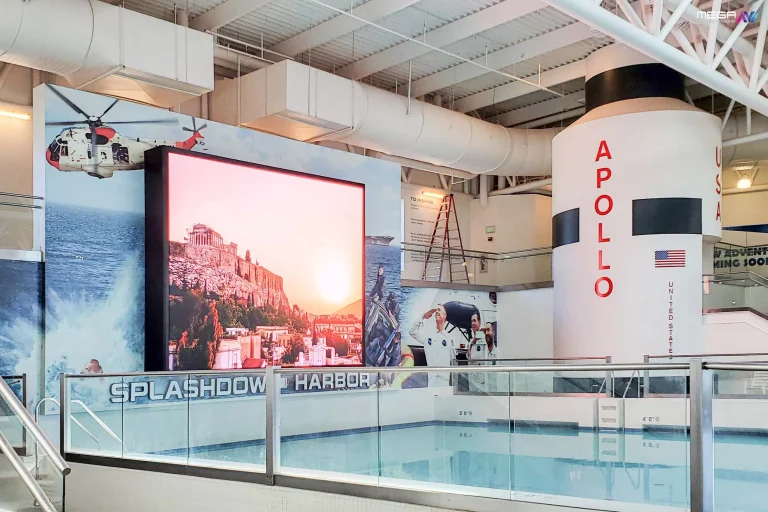
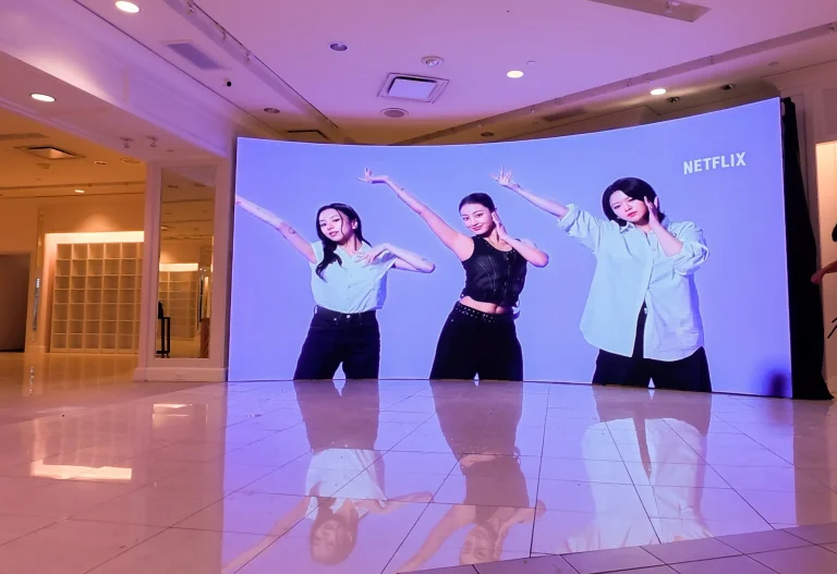
Place displays where people already pause: entrances, corridor intersections, escalator landings, and food-court seating. Large-format indoor video walls suit atriums where the ceiling is high and the read is long.

Consistent signs make a store feel run on purpose. Mismatched signs read as temporary, and shoppers price a temporary-looking store lower than a settled one.
Pick one typeface family and use it on everything, including the shelf card someone taped up last Tuesday. Reserve a single accent color for sale messaging only, so shoppers learn what that color means without being told.
Your market position shows up here more than in your logo. A crisp type with white space reads “premium,” and a dense type with bright color reads “value.”
Placement decides whether a message is seen. No amount of design rescues a sign in the wrong spot, so put signs at decision points: the moment someone picks a direction, a product, or the door itself.
Walk your store the way a stranger does. Stand at the curb, then the entrance, then the first aisle break, noting where you would hesitate. Those hesitation points are your sign locations.
Check sightlines at eye height, since a sign perfect at 8 feet disappears behind a shelf at 5 foot 6. Watch the lighting too. A window poster facing west washes out at 5pm, which is where an illuminated sign earns its price.
Expensive signage mistakes are boring ones: too many words, the wrong location, and a message nobody updated. A sign advertising a sale that ended in March tells shoppers nothing in your store is current.
One pattern we’ve seen repeatedly is a good sign in a bad spot, usually because it went where the wall was empty rather than where the shopper hesitates.
Clutter is the other one. When six signs compete in a 10-foot span, shoppers read none of them. Set a recurring audit, monthly for print and weekly for digital, and walk it with fresh eyes.
Screens fail differently than posters. They fail with motion nobody can follow, timing that outruns the reader, and content that quietly stopped updating three months ago.
Keep transitions simple and hold each message long enough to be read twice at walking speed. If the content never changes, you paid for a screen and got an expensive print.
Watch the delivery side as well as the creative. Check that the controller is still online and that the scheduled content actually expired, then confirm the brightness suits the room. Assign one named person to the content calendar, or it becomes nobody’s job by week three.
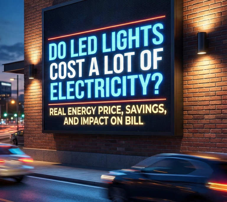
A Premier outdoor LED sign at 6mm or 8mm SMD reads clearly up close and from the road at those speeds. Start here: https://www.megasigninc.com/premier-outdoor-led-signs/
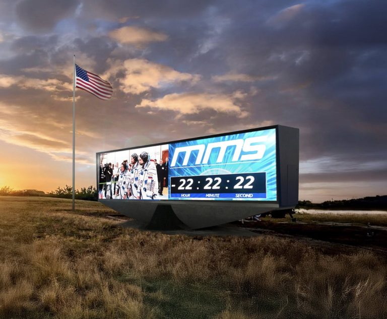
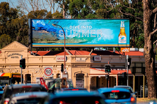
A digital billboard format with 16mm DIP LEDs carries a message across highway distances. See the options: https://www.megasigninc.com/digital-billboards/
A VERSA scrolling LED sign mounts in the window and runs off a standard outlet, from $400 to $2,000 and up. Take a look: https://www.megasigninc.com/versa-scrolling-led-sign/
A large indoor LED video wall at 6.6mm, 2.9mm, or 2.6mm pitch anchors a feature space. Explore it: https://www.megasigninc.com/large-indoor-led-video-wall/
The content that sells removes a reason not to buy. Build your loop from four types rather than one: a time-bound offer, a short how-to answering your most-asked staff question, something worth watching, and a direction cue. Keep each message readable in the time a shopper actually stands there, a few seconds in an aisle and much longer in a queue, then change it on a schedule, because content that never updates trains people to stop looking at the screen.
Number your aisles at both ends and use the words your customers use. A shopper walking from the back needs the same information as one walking from the front, and a category name from your inventory system rarely matches what people say out loud. Hang one blade sign per aisle at head height so it reads down the run, keeping any wall-mounted projection within the accessibility limits for circulation paths, then add one direction cue from the deepest corner pointing to checkout and restrooms and stop there, because every extra sign makes the useful ones harder to see.

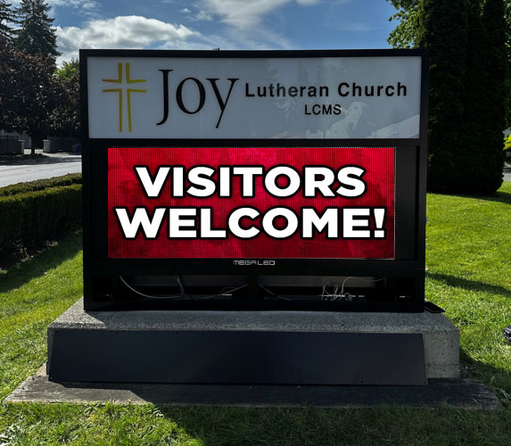



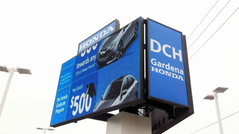

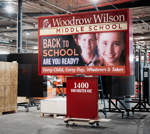



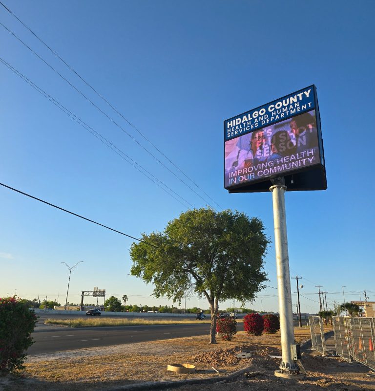

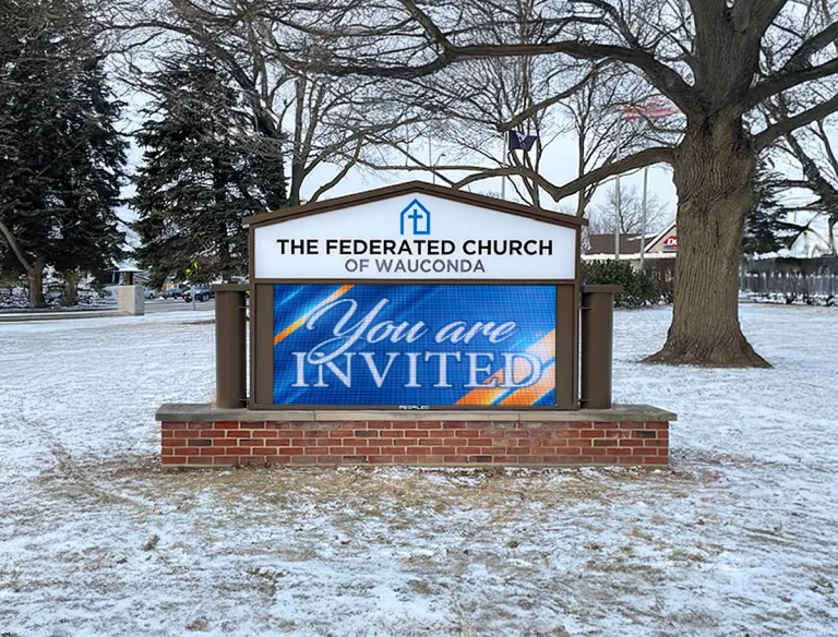


Alpha LED sign boards are great for anything from churches, to schools, to business. They tend to do great in large open spaces, where they are clearly visible.
Omega is our newest line of outdoor digital signs. Running the full gambit from cabinet, to LED sign, to logo on top, or any configuration of your choice!
Premier is a customizable Outdoor LED sign, perfect for the Entrepreneur who knows that large custom sized signs cultivated for their specific business is the way to go.
Programmable Stage LED signs, great for indoor assemblies, congregations, and presentations! Blow your competitors out of the water, or keep your congregation and audience glued to your message.