Summer Church Signs: What Are The Best Sayings And Ideas For The Season?

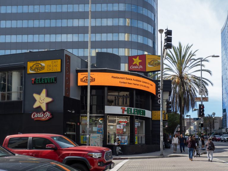
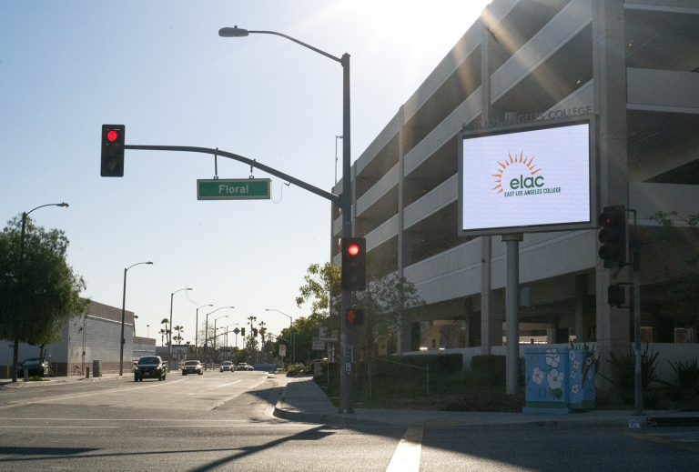
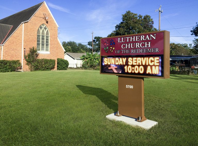
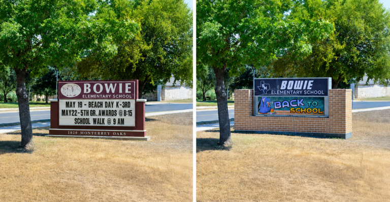
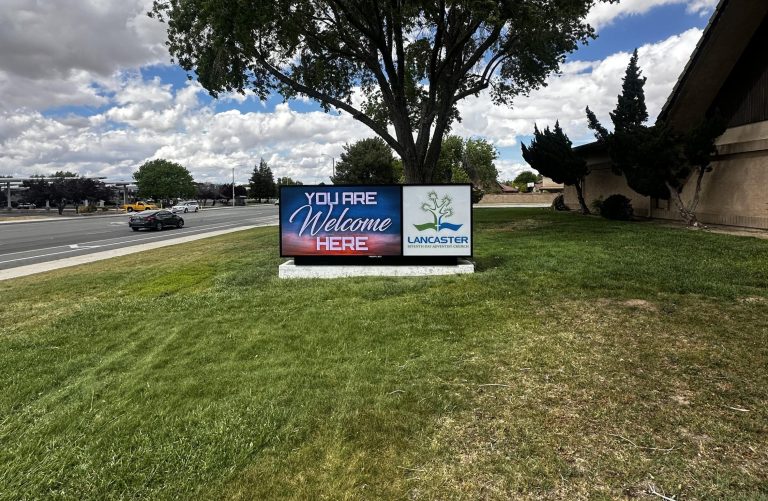
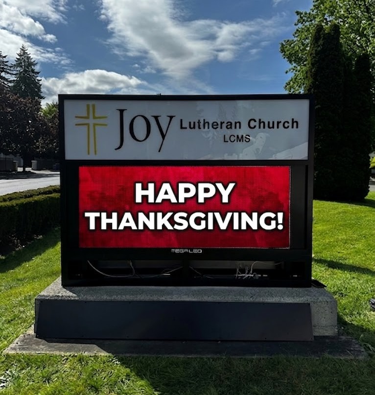
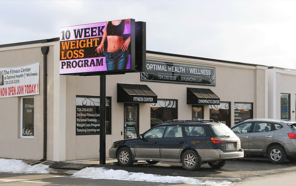
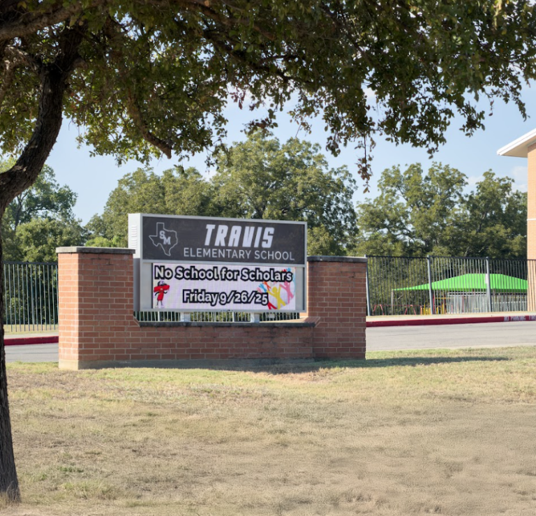
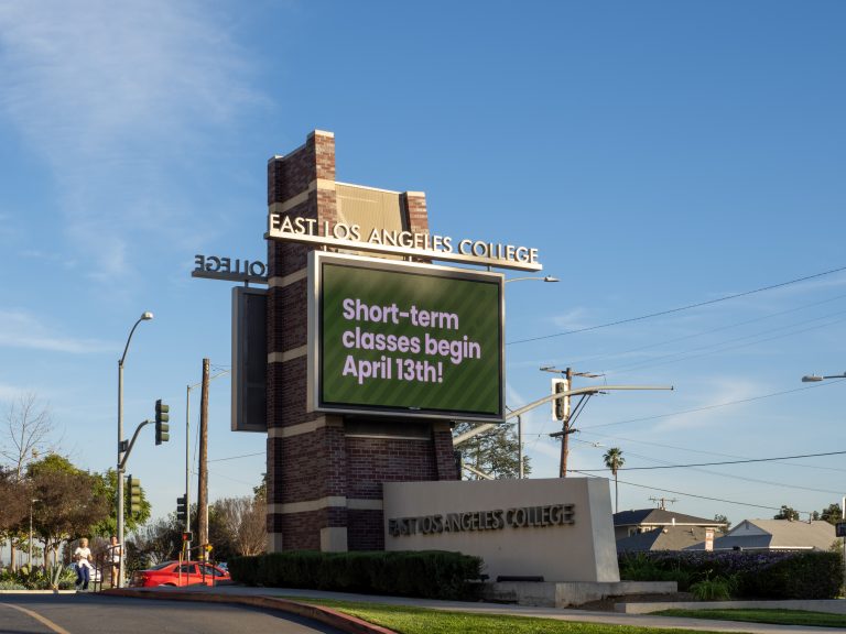
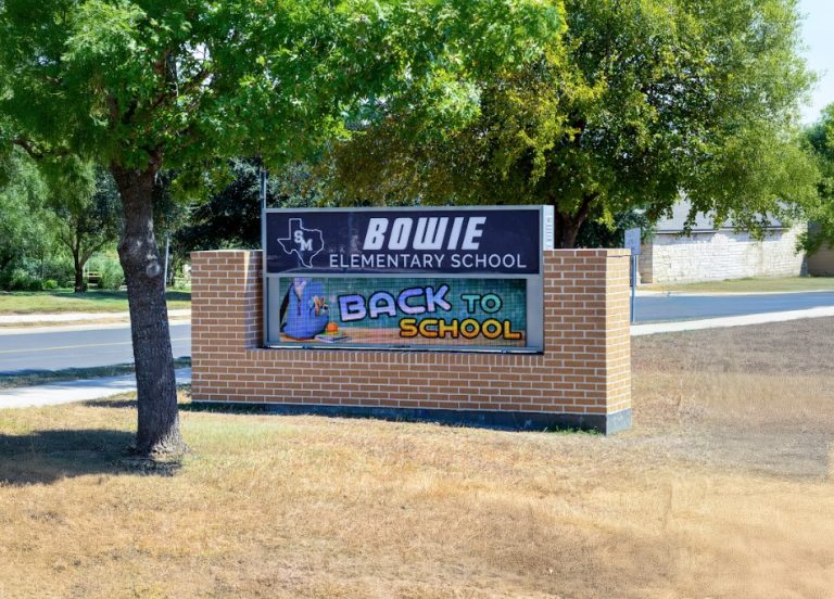
Alpha LED sign boards are great for anything from churches, to schools, to business. They tend to do great in large open spaces, where they are clearly visible.

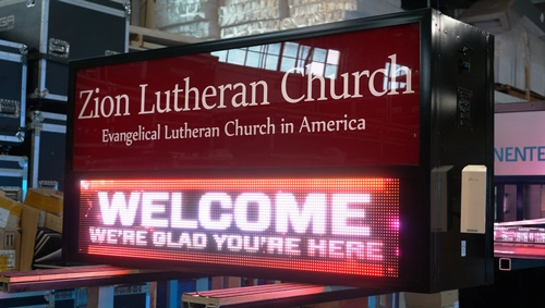
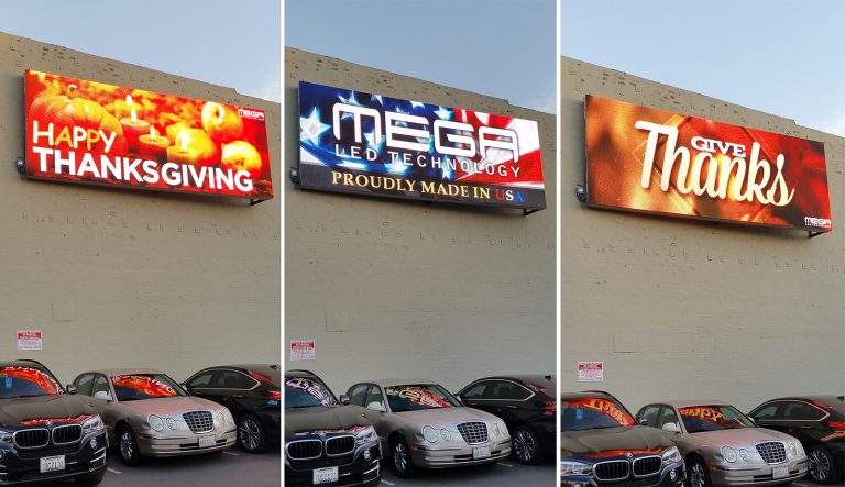
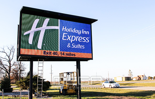
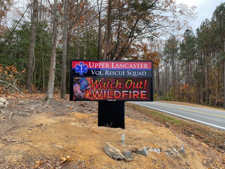
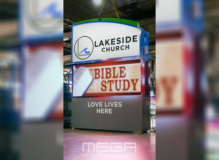
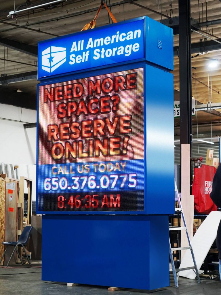
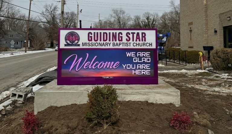
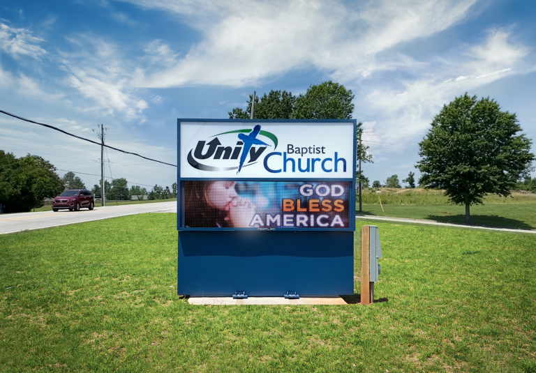
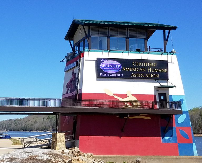
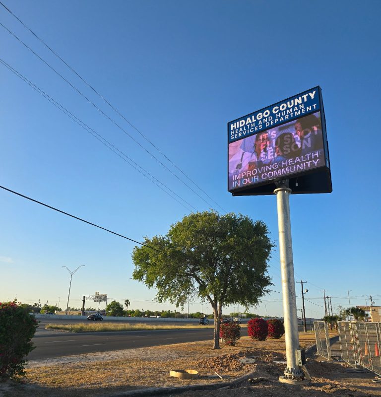
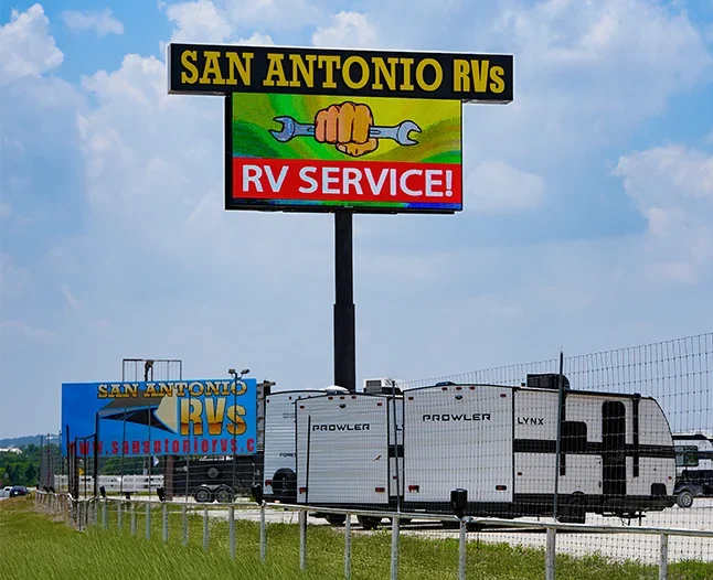
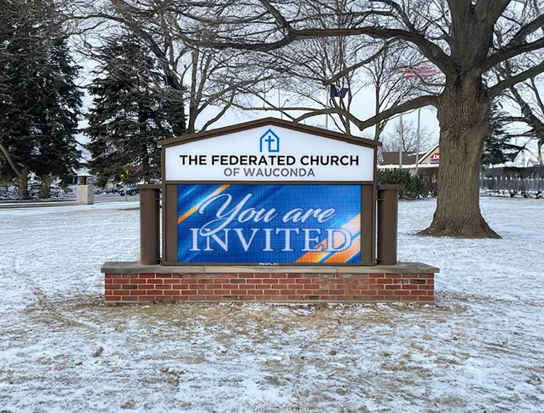
Omega is our newest line of outdoor digital signs. Running the full gambit from cabinet, to LED sign, to logo on top, or any configuration of your choice!

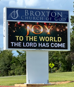
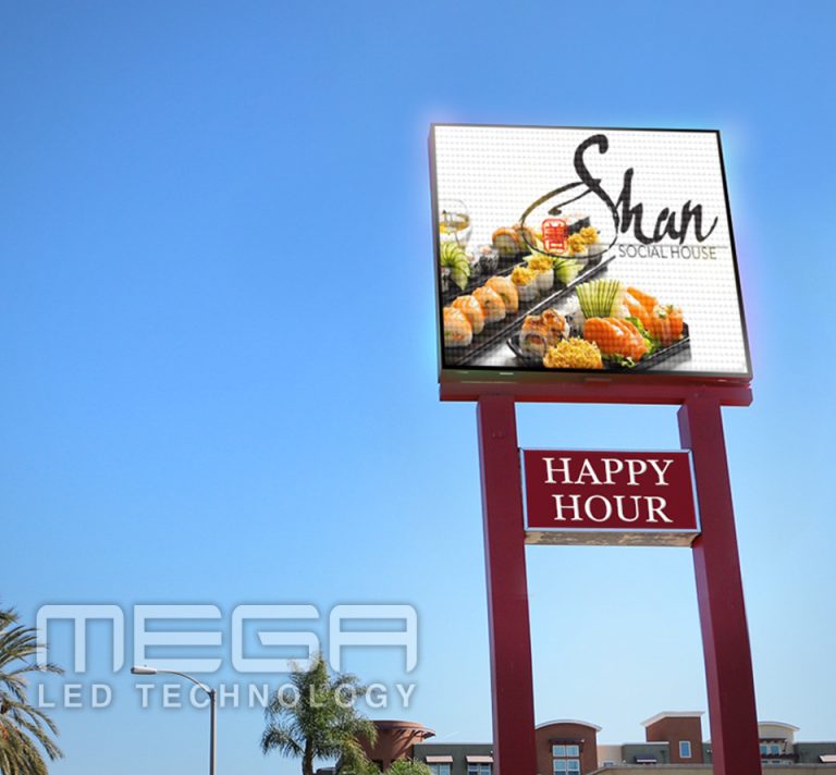
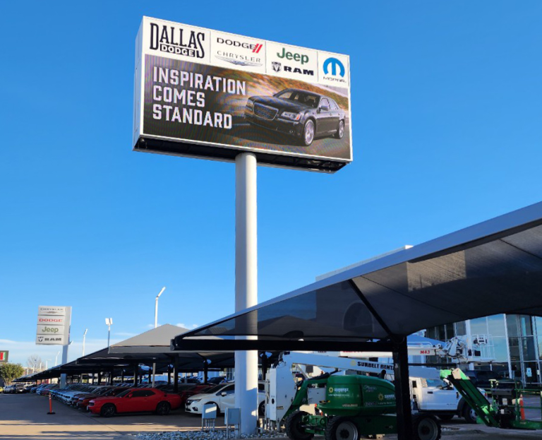
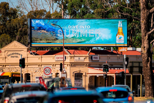
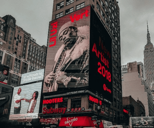
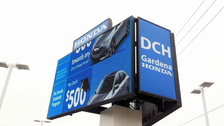
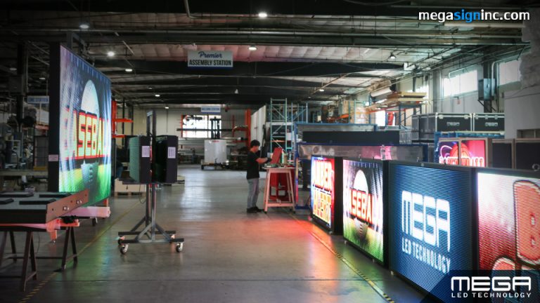
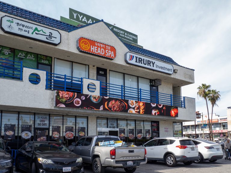
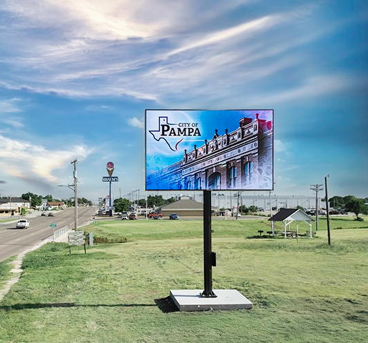
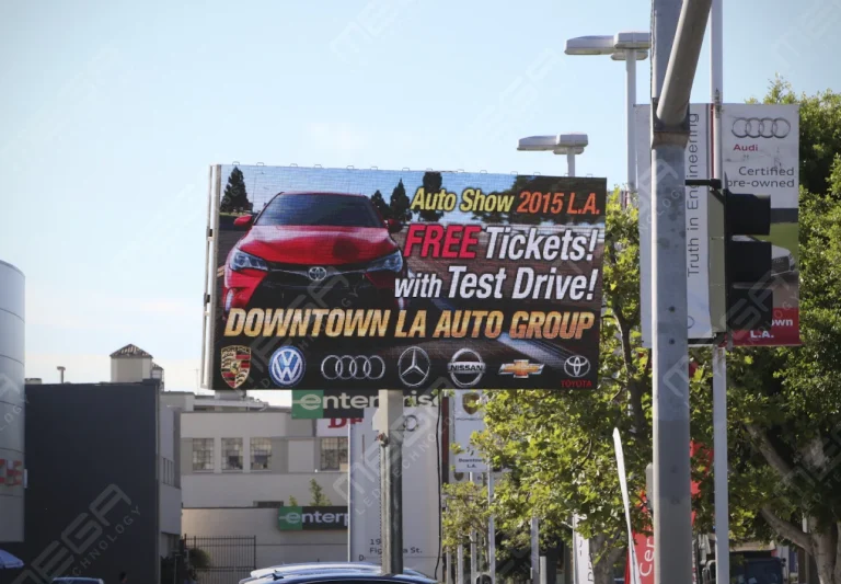
Premier is a customizable Outdoor LED sign, perfect for the Entrepreneur who knows that large custom sized signs cultivated for their specific business is the way to go.

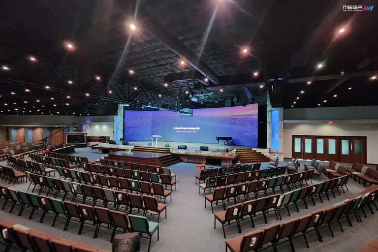
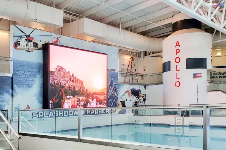
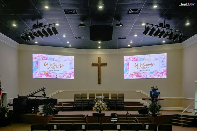
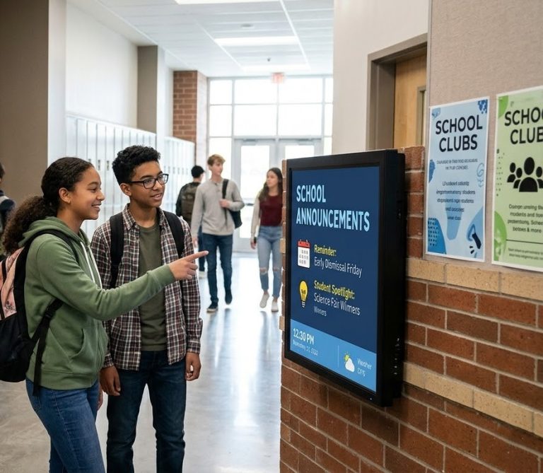
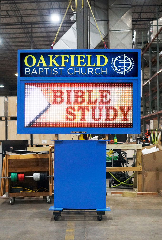
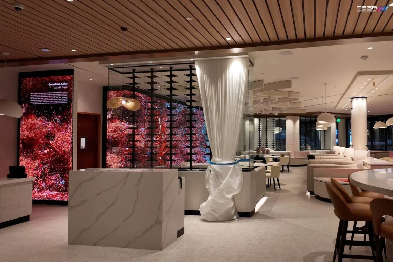
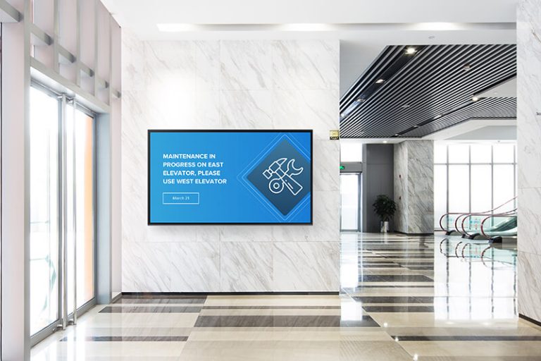
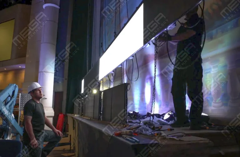
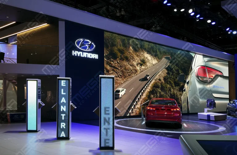
Programmable Stage LED signs, great for indoor assemblies, congregations, and presentations! Blow your competitors out of the water, or keep your congregation and audience glued to your message.

Alpha LED sign boards are great for anything from churches, to schools, to business. They tend to do great in large open spaces, where they are clearly visible.
Omega is our newest line of outdoor digital signs. Running the full gambit from cabinet, to LED sign, to logo on top, or any configuration of your choice!
Premier is a customizable Outdoor LED sign, perfect for the Entrepreneur who knows that large custom sized signs cultivated for their specific business is the way to go.
Programmable Stage LED signs, great for indoor assemblies, congregations, and presentations! Blow your competitors out of the water, or keep your congregation and audience glued to your message.
Most businesses spend thousands on ads people scroll past in seconds, while customers walking or driving by see nothing worth stopping for. Poor signage is one of the most expensive invisible problems a business can have. This guide covers every major outdoor sign type, the mistakes that cost you customers, and how to build a sign strategy that earns its space.
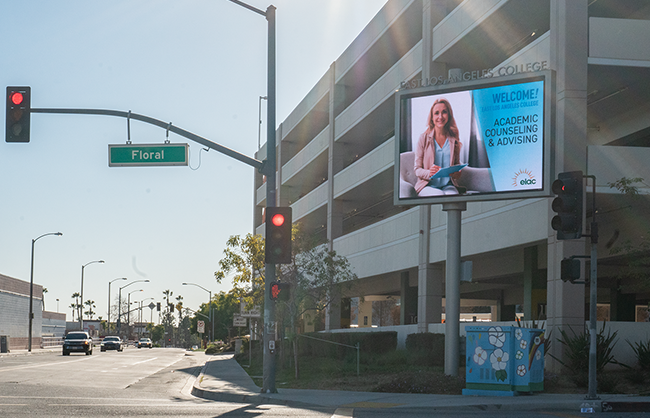
Good outdoor signage does four things quickly: it gets noticed, communicates clearly, builds trust, and drives action. Every sign idea in this guide is evaluated against those four criteria.
Before choosing a sign type, identify your placement zone and viewing distance. A sign readable at 10 feet fails at 100 feet. Pedestrian banner fails on 50-mph road. Match format to where the viewer is, at what speed, and how long they can see it. 
Three quick wins before you choose anything:
Think in zones, not single signs. A practical sign stack covers primary identification, secondary messaging, directional guidance, and promotional formats. Different zones need different sizes, materials, and messages. Here is a quick reference:
| Zone | Best Sign Type | Format | Priority |
|---|---|---|---|
| Roadside / Street | Monument, post sign, pole banner | Large format, high contrast | Visibility from 100+ ft |
| Parking / Entry | Feather flag, directional sign | Motion, arrow, simple text | Immediate orientation |
| Storefront / Sidewalk | Frame sign, vinyl banner, decal | Eye-level, changeable | Decision-moment messaging |
| Facade / Wall | Wall graphic, backlit decal | Large brand elements | Brand authority at a glance |
| Window / Door | Window signage, static decals | Hours, offers, guarantees | Last-second conversion |
Monument and post-mounted signs are your primary identification layer. Monument signs sit at ground level and signal permanence.
Post-mounted panels offer height and road visibility. Both suit permanent locations where brand identity needs to anchor the property.
Height is regulated by most municipalities, typically 6 to 10 feet without a permit. Position signs perpendicular to the road for the widest visibility angle, and keep the face clear of trees and parked vehicles.
Material choice affects both appearance and maintenance over time. Aluminum post signs resist rust and stay clean with minimal upkeep, making them the standard for most commercial applications. Wood posts create a warmer, more traditional feel but require staining or sealing every two to three years to prevent weather damage.
For businesses that want the permanence of a monument sign with the flexibility of digital content, our Omega monument signs combine a durable freestanding structure with a programmable LED display that updates in seconds.
Yard signs are fast, affordable, and underrated for local campaigns. They perform best for grand openings, hiring announcements, limited-time promotions, and event directions.
Keep messaging to five words or fewer with one clear call to action. For route-based placements, space signs 200 to 300 feet apart so drivers process each one before the next appears.
Quantity creates recall: a single yard sign is easy to miss, but 20 along a route build awareness.
Panel signs offer a cleaner, more professional look than corrugated plastic. Their rigid surface resists warping in heat and holds print quality longer outdoors.
They mount to standard H-frame posts or stake directly into the ground, and their smooth face makes text and logos crisper from a distance.
Use panels when signage needs to stay up for months, or when the corrugated look conflicts with a premium brand image.
Explore our Premier outdoor LED signs and see how businesses across the country use them to solve exactly the visibility problems covered above.
Standard banners in windy locations become a liability. Wind-rated signs use reinforced stitching, heavy-duty grommets, and perforated material to let air through rather than build pressure.
For exposed locations (rooftops, coastal storefronts, elevated structures), choose hardware with locking mechanisms and verify the banner material is rated for sustained winds above 30 mph. A sign that tears loose costs far more than the upgrade to wind-safe hardware.
A-frame and sandwich board signs deliver the highest ROI for foot traffic. They sit at eye level, update daily without printing costs, and create a decision moment right at your entrance. Keep them stable with weighted bases on windy days and clear of any ADA accessibility paths. One offer, one price, one action per sign.
Anything more stops being read before the customer reaches your door.
Vinyl banners are the fastest high-impact format available. They print in 24 to 48 hours, install in minutes, and mount on nearly any surface.
For outdoor use, specify hemmed edges and brass grommets every 2 feet to prevent tearing. Use a minimum 7-inch letter height for 75-foot viewing distance, limit copy to one headline and one supporting line, and avoid glossy finishes in direct sunlight as glare kills readability.
Mesh banners use a perforated weave that lets air pass through, sharply reducing wind load. They are the right choice for fence lines, scaffolding wraps, and installations above 15 feet where solid vinyl would act as a sail.
Print vibrancy is slightly reduced compared to solid vinyl, making mesh best for bold logos and text rather than photography. In high-wind zones, mesh outlasts solid vinyl by months.
Pole banners create vertical visibility and brand repetition along a street or parking corridor. Mounted on light poles or purpose-built hardware, they work in pairs to create an immersive brand environment for events or seasonal campaigns.
Most municipalities require a permit for installation on public poles, so confirm requirements before ordering.
Design for distance: your logo and one short message are all that registers at driving speed.
Motion attracts attention in a way static signs cannot. Feather and teardrop flags create movement even in light breeze, making them effective in parking lots, roadside displays, and outdoor events. Match the base to the surface (ground spike for grass, cross base for pavement) and verify wind ratings.
Message discipline is critical: your brand mark and no more than three words. Anything longer flaps too fast to be read.
Backlit decals solve one of the most common visibility failures: a storefront that goes dark after 6pm. Internal lighting creates contrast in low-light conditions, keeping hours, logos, and offers readable from the street.
For permanent decals, installation quality is everything. Bubbles and lifting edges degrade your brand image fast. Use outdoor-rated UV vinyl with professional squeegee application for any sign expected to last two or more years.
Exterior walls are underused real estate for most businesses. Large-format wall graphics extend brand identity beyond the storefront fascia, increasing visibility from side streets. Surface preparation matters: clean, cured, properly primed paint before applying vinyl.
Weather degrades adhesion faster on rough or porous surfaces, so specify outdoor-rated laminates for any installation expected to last beyond 18 months.
Scale is the advantage wall graphics have over every other sign type in this guide. A 10-by-20-foot wall graphic visible from a cross street creates a level of brand presence that no A-frame or banner can match. For businesses on corner lots or near intersections, a side-wall graphic effectively doubles your street-facing visibility without adding a second freestanding sign.
Pair it with exterior lighting or a backlit element to extend that visibility into evening hours when most competing storefronts go dark.
The window and door area is where purchase decisions get made.
Window signage at this point should answer final objections: hours, payment options, best-selling product, and your guarantee. Rotate seasonal offers to stay fresh for regulars.
Avoid covering more than 25% of window area, both for interior visibility and to follow most local sign ordinances.
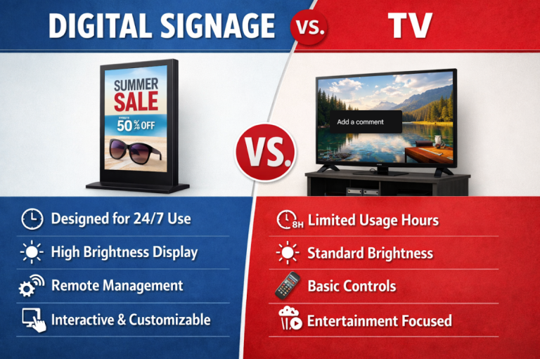
Digital window displays take this format further by letting you rotate offers throughout the day without printing anything new. That level of responsiveness is impossible with static decals, and it keeps your window content relevant to whatever the customer standing outside actually wants right now.
Browse our Alpha LED sign boards for window-friendly digital displays that update from your phone.
Confused customers leave. Directional signs for parking, accessible routes, pickup zones, and secondary entrances reduce the number of people who give up and drive away.
Use one direction per sign, consistent terminology, and place signs before the decision point. A sign telling you where to turn after you have already passed it is useless. 
If your location is hard to find, a directional sign at the nearest intersection outperforms any promotional banner.
Clarity beats creativity every time. A sign readable in 3 seconds outperforms a beautiful design that takes 5 seconds to decode.
A nationwide signage survey of 1,000 consumers found that 76% have entered a store they never visited before based on its signs, and 68% believe sign quality reflects product quality.
Apply these to every sign:
At MEGA LED Technology, we help businesses match the right sign type, materials, size, and lighting to their specific location. Our outdoor LED signs include design proofing so you know exactly how the sign reads in real conditions before it ships.
Most signage failures are avoidable. The most common problems: font too small for viewing distance, too much copy, low-contrast colors, placement behind obstructions, and no clear call to action. Before approving any sign:
Compliance is often overlooked. Municipalities regulate height, placement, and sign area.
Accessibility is equally important: the ADA signage standards set federal requirements for tactile characters, contrast, mounting height, and placement on signs identifying permanent rooms and spaces in public-facing buildings. 
Our team at MEGA LED Technology can walk you through local requirements so your installation does not cause a code violation after the sign is already up.
Templates help with the hardest part of design: structure. They handle spacing, alignment, and hierarchy so you do not end up with uneven margins or competing font sizes. According to signage industry data from UPrinting, the signs and banners industry generates $16.7 billion annually, which means templates are everywhere. The risk is looking exactly like every competitor who used the same one.
Customize every template with your actual brand colors, your typeface, and your specific offer. Replace stock photography with real images of your location or product. Remove any decorative element that does not add information. The most effective outdoor signs have almost nothing on them except what the viewer needs to act. If you are debating whether to add an element, remove it.
Test your finished design at actual scale before committing to print. Most sign shops will produce a proof at reduced size, but that does not replicate the viewing experience. Print a full-size section of your design on paper, tape it to the intended surface, and evaluate it from the street.
This ten-minute exercise catches font sizing errors, color contrast problems, and readability issues that look fine on a laptop screen but fail completely at 50 feet.
The best ideas start with your placement zone. Roadside locations need large, high-contrast signs readable at speed. Sidewalk locations need eye-level formats with short, changeable messages. Window and door areas need decision-moment content like hours, offers, and guarantees. No single type is best everywhere: a sign stack covering all zones from street to entry delivers the strongest results.
Match sign type to viewing distance and dwell time. Monument and post signs for roadside identity, feather flags and banners for parking and events, A-frame and window signs for sidewalk and entry messaging, and wall graphics and backlit decals for facade presence and nighttime visibility. The table in this article summarizes each zone with the recommended format and priority.
The best ideas start with your placement zone. Roadside locations need large, high-contrast signs readable at speed. Sidewalk locations need eye-level formats with short, changeable messages. Window and door areas need decision-moment content like hours, offers, and guarantees. No single type is best everywhere: a sign stack covering all zones from street to entry delivers the strongest results.
A monument or post-mounted sign from MEGA LED gives you consistent roadside presence that builds recognition week after week.
Feather flags or pole banners create motion and repetition that gets noticed even at driving speed.
An A-frame sign lets you change offers every day without reprinting, ideal for specials and promotions.
Window signage or a wall graphic builds permanent brand presence at the point of entry where purchase decisions happen.
Match sign type to viewing distance and dwell time. Monument and post signs for roadside identity, feather flags and banners for parking and events, A-frame and window signs for sidewalk and entry messaging, and wall graphics and backlit decals for facade presence and nighttime visibility. The table in this article summarizes each zone with the recommended format and priority.

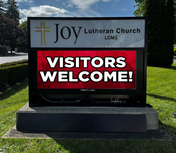
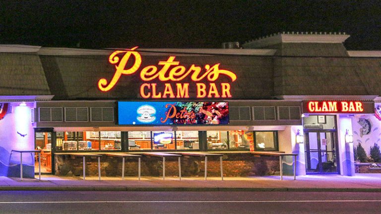
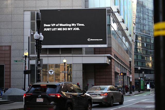



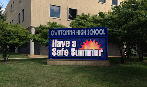

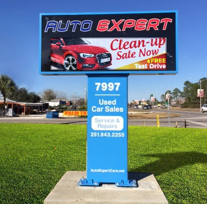

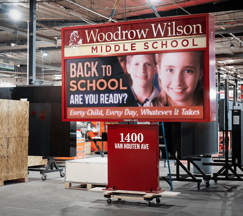

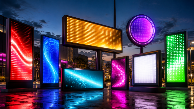


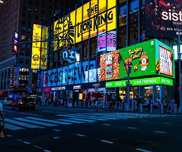
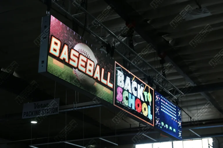


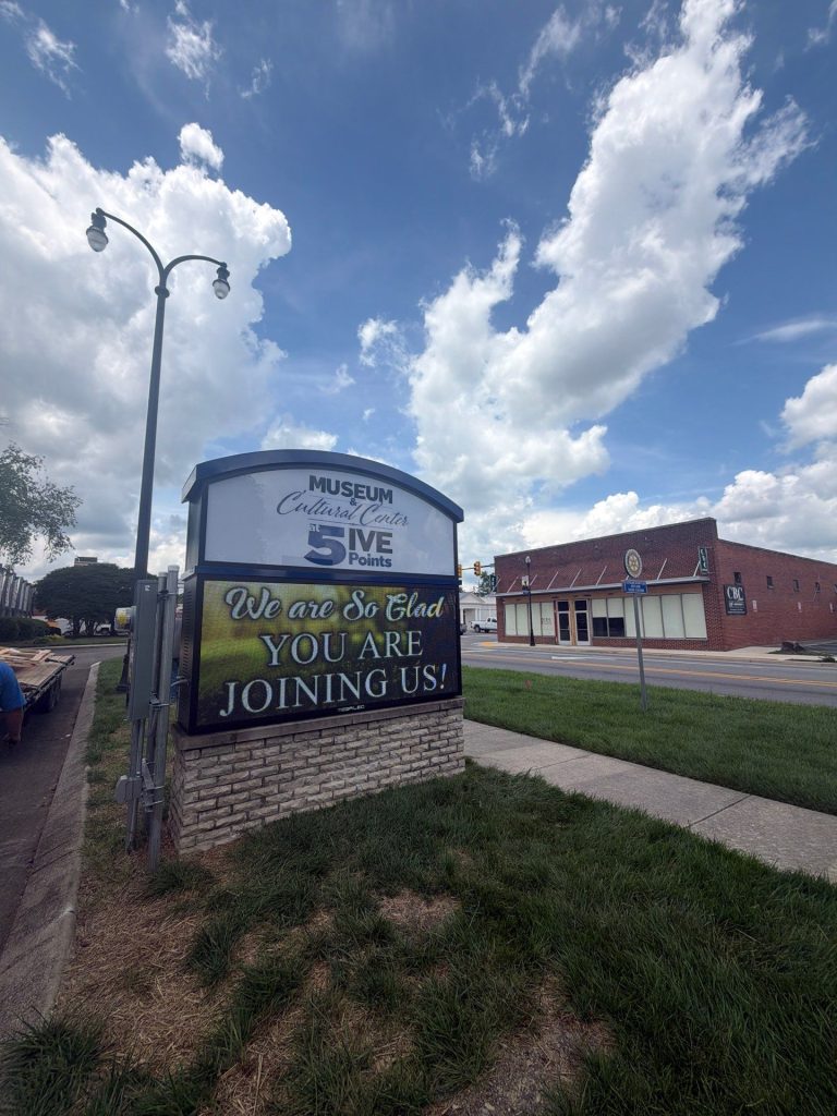
Alpha LED sign boards are great for anything from churches, to schools, to business. They tend to do great in large open spaces, where they are clearly visible.
Omega is our newest line of outdoor digital signs. Running the full gambit from cabinet, to LED sign, to logo on top, or any configuration of your choice!
Premier is a customizable Outdoor LED sign, perfect for the Entrepreneur who knows that large custom sized signs cultivated for their specific business is the way to go.
Programmable Stage LED signs, great for indoor assemblies, congregations, and presentations! Blow your competitors out of the water, or keep your congregation and audience glued to your message.