Summer Church Signs: What Are The Best Sayings And Ideas For The Season?

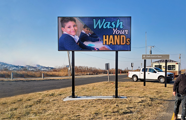
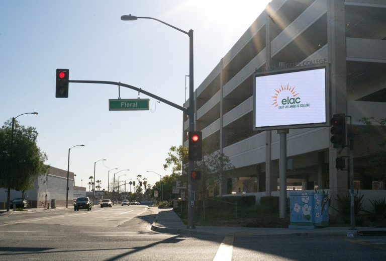
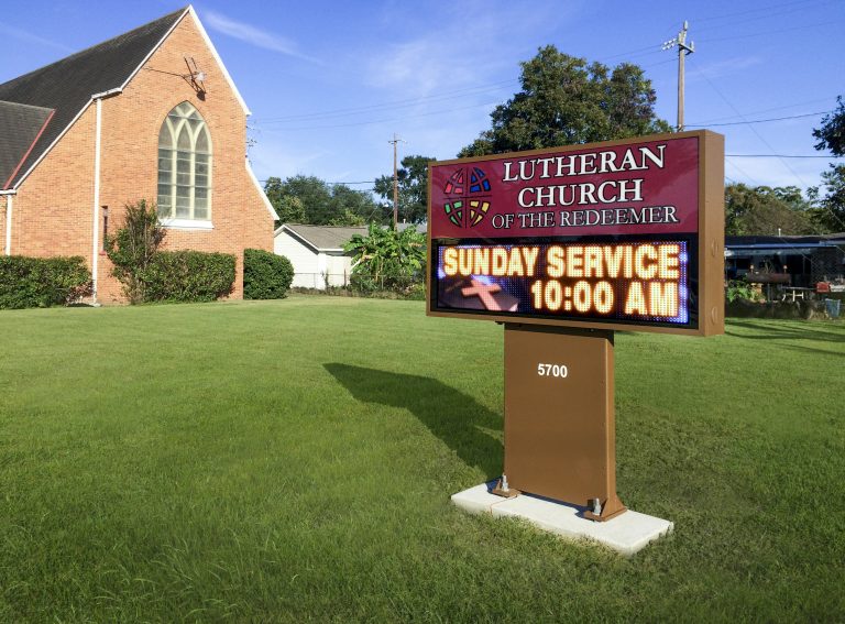
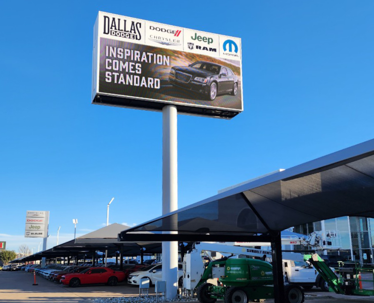
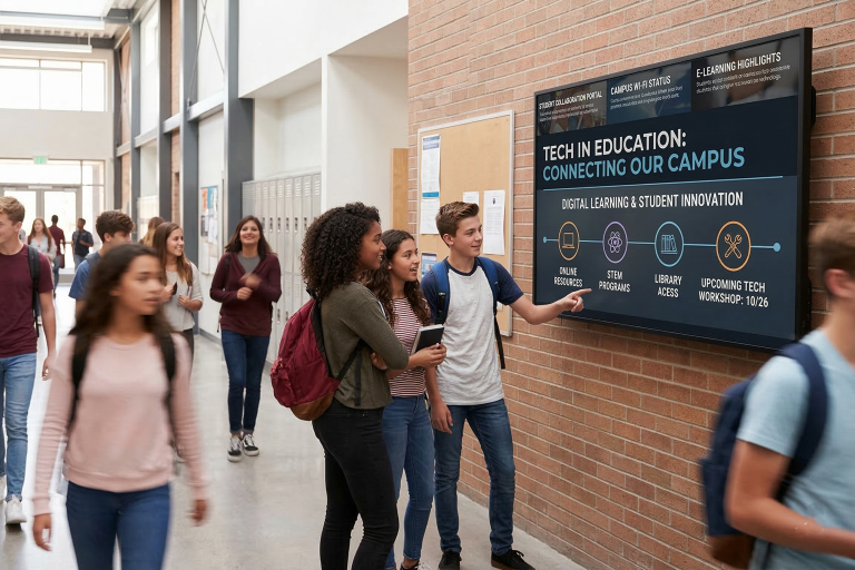
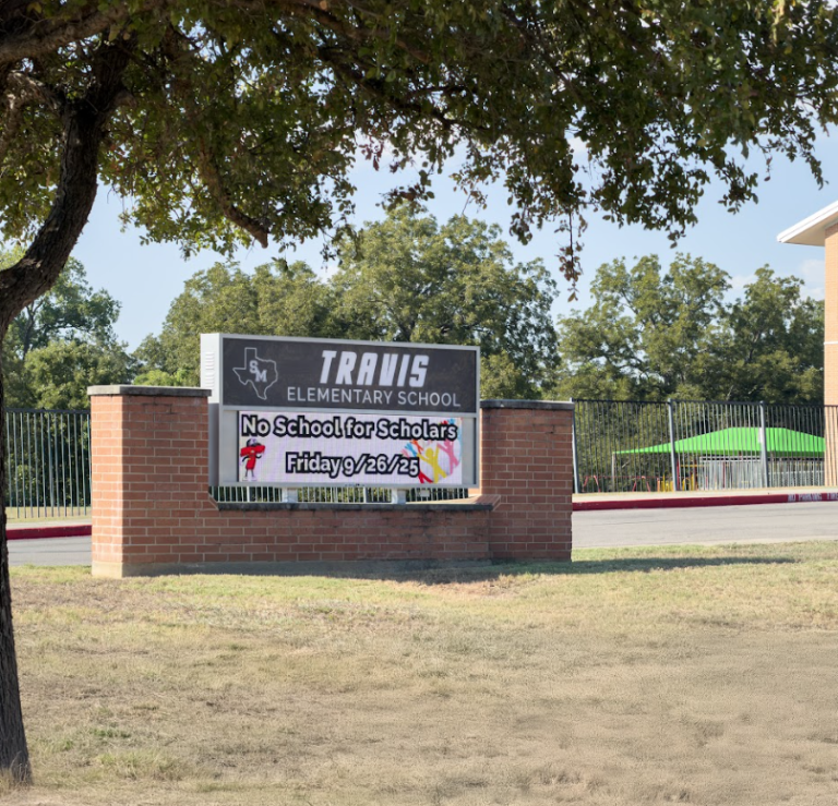
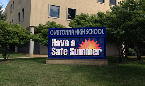
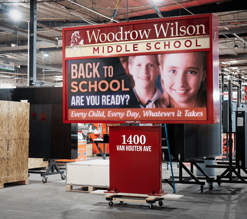
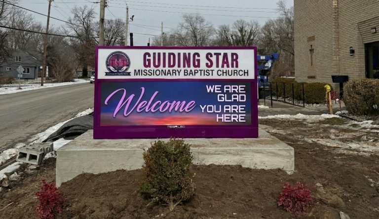
Alpha LED sign boards are great for anything from churches, to schools, to business. They tend to do great in large open spaces, where they are clearly visible.

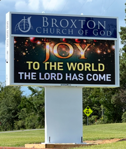
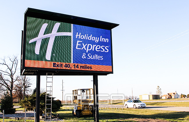
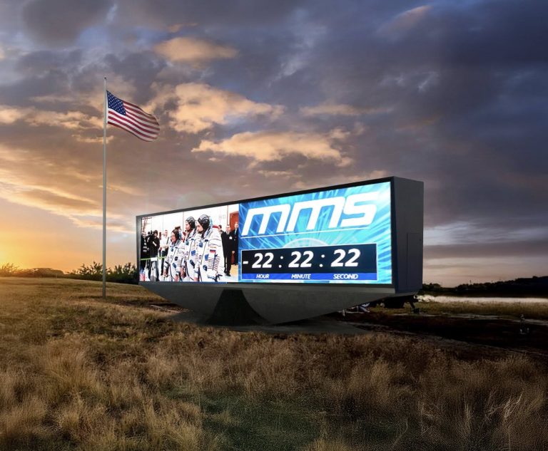
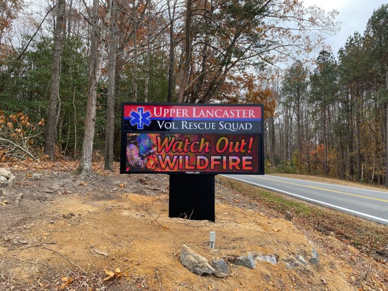
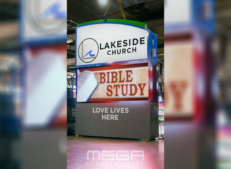
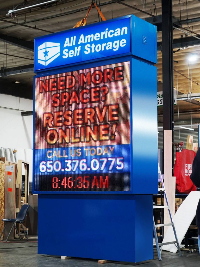
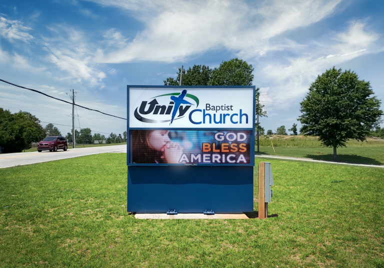
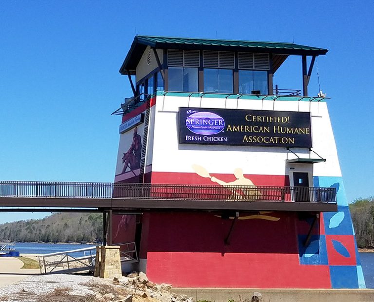
Omega is our newest line of outdoor digital signs. Running the full gambit from cabinet, to LED sign, to logo on top, or any configuration of your choice!

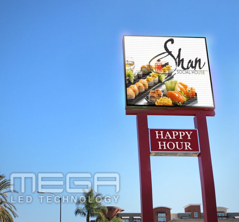
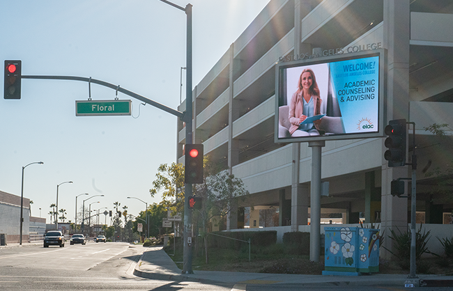
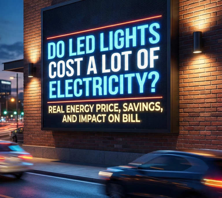
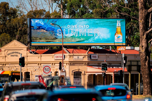
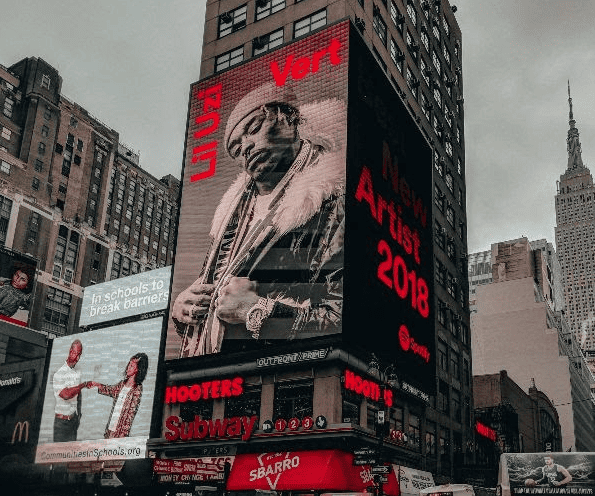
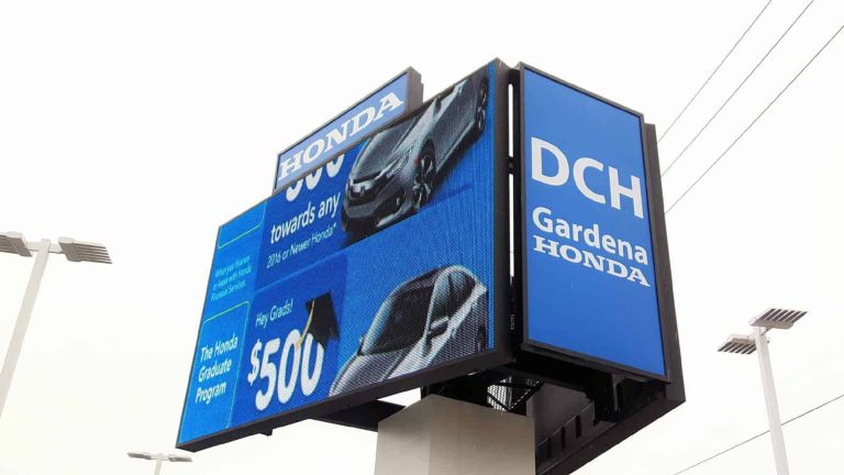
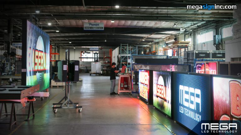
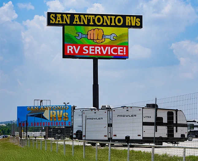
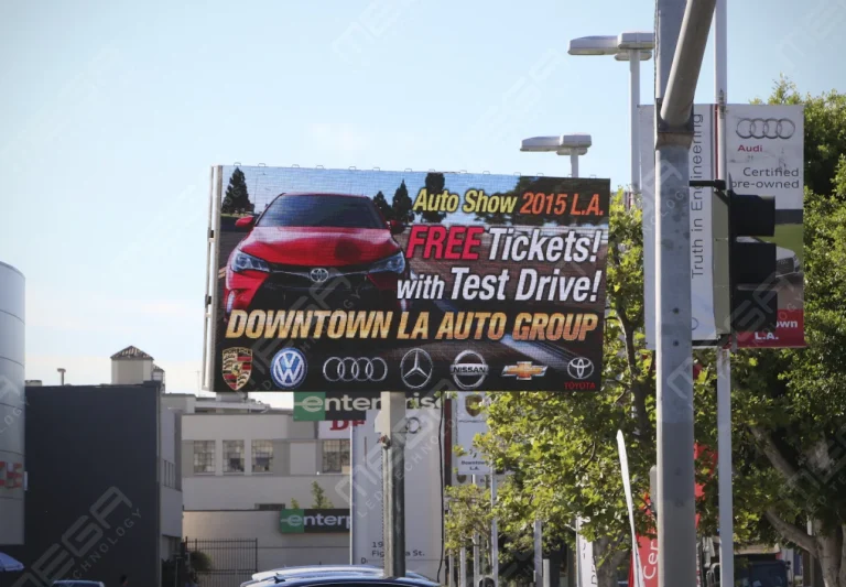
Premier is a customizable Outdoor LED sign, perfect for the Entrepreneur who knows that large custom sized signs cultivated for their specific business is the way to go.

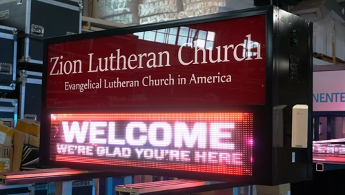
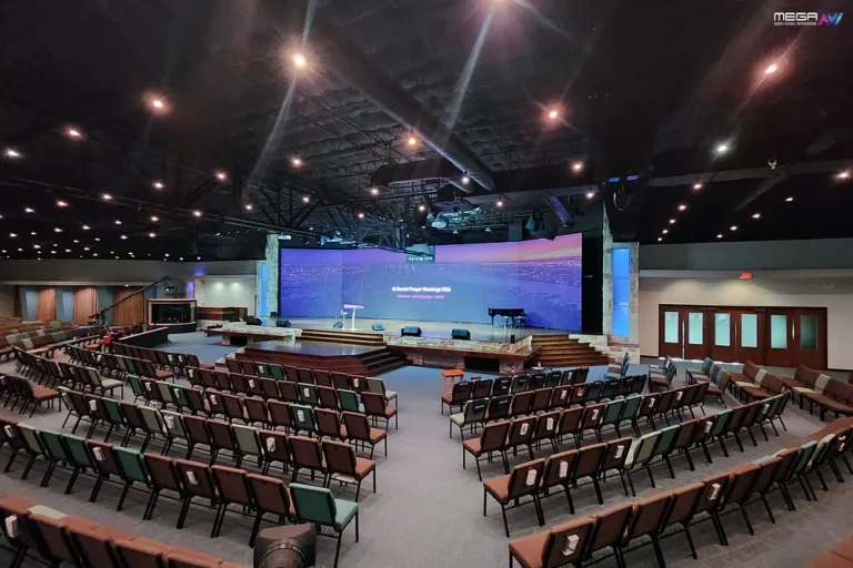
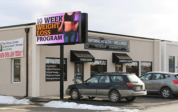
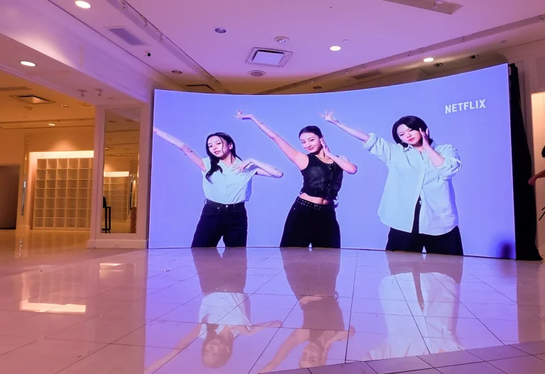
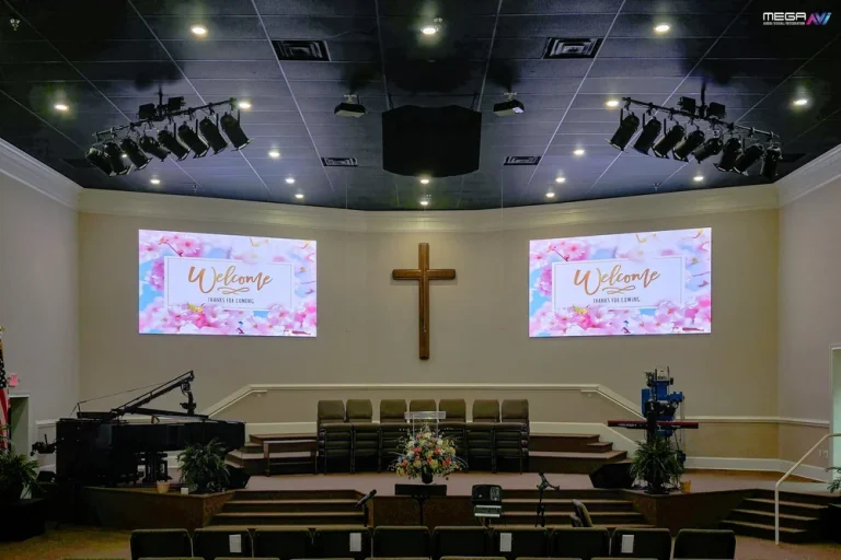
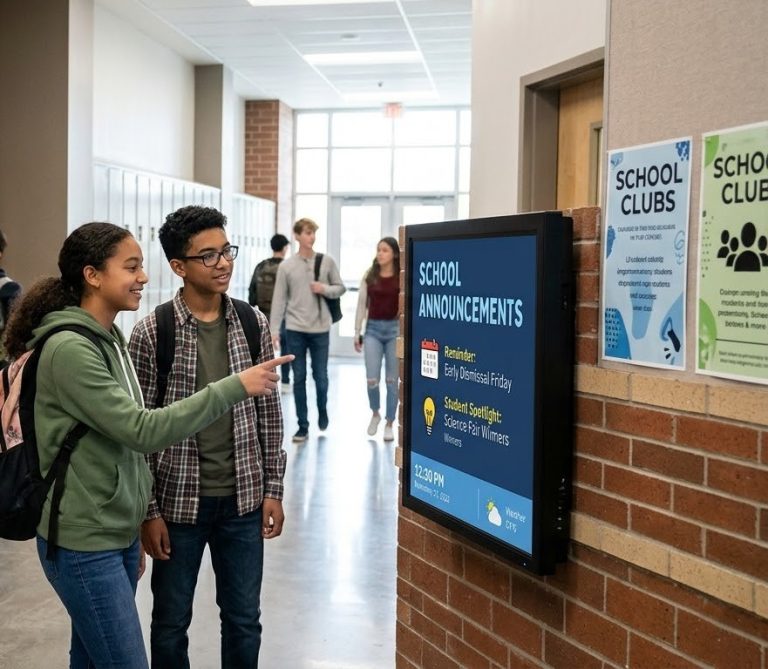
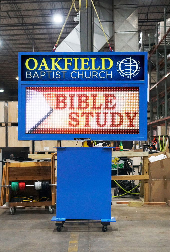
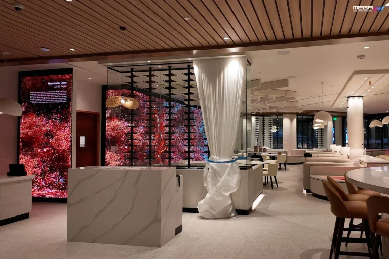
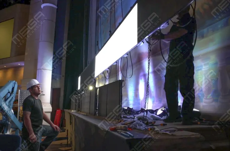
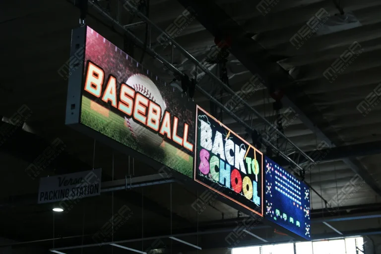
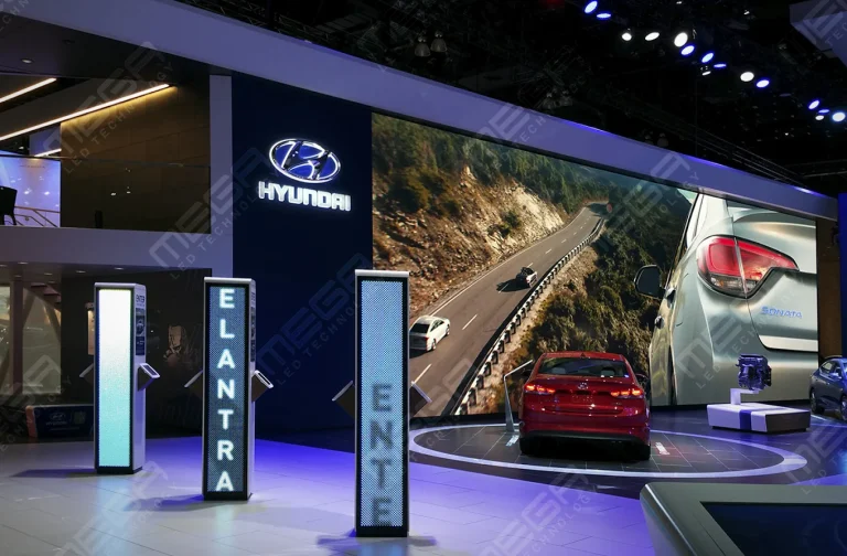
Programmable Stage LED signs, great for indoor assemblies, congregations, and presentations! Blow your competitors out of the water, or keep your congregation and audience glued to your message.

Alpha LED sign boards are great for anything from churches, to schools, to business. They tend to do great in large open spaces, where they are clearly visible.
Omega is our newest line of outdoor digital signs. Running the full gambit from cabinet, to LED sign, to logo on top, or any configuration of your choice!
Premier is a customizable Outdoor LED sign, perfect for the Entrepreneur who knows that large custom sized signs cultivated for their specific business is the way to go.
Programmable Stage LED signs, great for indoor assemblies, congregations, and presentations! Blow your competitors out of the water, or keep your congregation and audience glued to your message.
Learning how to design a billboard looks like a graphic design problem. It is not: your reader is moving at 60 miles an hour, holding a single glance, and reading from 500 feet away. Design for that, and the creative decisions start making themselves.

Billboard design runs in a fixed order, and each step narrows the next one, so skipping ahead means redrawing everything.
Design for who is passing, not who you wish were passing. A commuter artery reaches the same drivers twice a day for months; an exit ramp gets one shot.
Motivation moves the message more than demographics do. A commuter responds to convenience, a tourist to a destination, and a local resident to news rather than introductions. The Out of Home Advertising Association of America’s 2024 Harris Poll study, The Effectiveness of Digital OOH Advertising, reports OOH research data showing 51% of adults who noticed a directional out-of-home ad then visited the business.
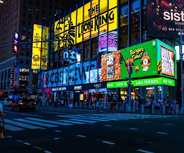
Produce separate versions when the audiences want different things, not when the locations have different addresses. Two boards on the same highway rarely need two designs; a board outside a hospital and one outside a stadium usually do.
Digital faces make this cheap, since one artwork set can rotate by location or hour. Keep the same color field, type, and logo position across versions so a driver who sees two recognizes one campaign. Stacking three messages onto one board so nobody is left out reliably leaves everybody out.
Send us the address and the road it faces, and we will tell you what size, height, and message timing local code allow. The quote comes back with the rules attached.
Seven words or fewer, and the reason is arithmetic rather than taste. A driver at 60 miles an hour covers 88 feet every second, so a board readable 250 feet out gives under three seconds.
Word length matters as much as the count. “Free brake check next exit” lands instantly; “Comprehensive automotive diagnostics available nearby” is also five words but takes longer to process. The International Sign Association’s guidance on sign legibility research puts minimum legibility distance at 265 feet for a sign passed at 55 to 60 miles per hour and 720 feet when a lane change is needed. The practical rule is simple: write for the shortest glance the message may receive, not the longest period the billboard remains visible.
The headline carries the campaign idea, not the company name. A board that only says who you are gives a driver nothing to do with the information.
Three headline jobs work at this distance: open a question, name a benefit, or demand one immediate response. Pick one, then give the board a single call to action, because two instructions cancel out at three seconds. In our experience, the board’s customers call in as wins pair one image, one line, and one action the image already implies.
Type has to be readable at distance before it is on-brand. Choose bold, wide letterforms with open counters and the enclosed spaces inside letters like an “or” or “e,” because those are close up first.
Size comes from the road, not the board. A useful starting benchmark comes from the Federal Highway Administration’s Manual on Uniform Traffic Control Devices (MUTCD), which recommends approximately 1 inch of letter height for every 30 feet of legibility distance for traffic-control signs. That is a useful human-factors benchmark for billboard design, not a federal billboard-size requirement. Local billboard and sign codes can impose separate rules.
More importantly, calculate from the distance at which your message is actually readable, not from an assumed five-second look. A board may technically be visible for five or ten seconds while trees, curves, traffic, viewing angle, competing signs, or small lettering leave only part of that distance usable. You can use our quick billboard readability calculator to give you an estimate:
Enter measurements:
Then calculate:
Speed in feet per second = mph × 1.47
Usable viewing time = clear reading distance ÷ feet per second
Minimum benchmark letter height = clear reading distance ÷ 30
For example, consider a board with 300 feet of genuinely clear reading distance on a 60 mph road:
Speed in feet per second = mph × 1.47
Usable viewing time = clear reading distance ÷ feet per second
Minimum benchmark letter height = clear reading distance ÷ 30
For example, consider a board with 300 feet of genuinely clear reading distance on a 60 mph road:
That 3.4 seconds is not 3.4 seconds of guaranteed attention. Drivers still have to watch the road. Treat the calculated time as the maximum physical opportunity to read the board, then make the message easier than that window appears to require.
| Posted Speed | Feet Traveled Per Second | Time Available Across 300 ft | Time Available Across 500 ft |
|---|---|---|---|
| 30 mph | 44 ft/sec | 6.8 sec | 11.4 sec |
| 40 mph | 59 ft/sec | 5.1 sec | 8.5 sec |
| 50 mph | 73 ft/sec | 4.1 sec | 6.8 sec |
| 60 mph | 88 ft/sec | 3.4 sec | 5.7 sec |
| 70 mph | 103 ft/sec | 2.9 sec | 4.9 sec |
We manufacture full-color digital billboards in the USA, sized and pitched for the road they face. One team handles design, permitting, manufacturing, and installation.
Contrast between foreground and background decides legibility; hue barely matters next to it. Dark type on light, or light type on dark, reads; two mid-tone colors do not.
Brand palettes break here: a soft sage and a warm cream sit at nearly the same brightness and collapse into one tone at 400 feet. Keep the brand colors, but push one until the pair separates in grayscale. Then check the site: a board against open sky loses light type at midday, and one behind trees loses dark type in shade.

An image lands before a word does, so let the image carry the meaning. A driver recognizes a shape in a fraction of the time it takes to read a line.
Use one focal point, because two competing graphics split attention and neither wins. Hierarchy comes from scale, position, contrast, and empty space: make the focal element clearly the largest, put it where the eye lands first, and leave real space around it. The eye should travel image, headline, brand, and action, with nothing competing for that line.
Simplify until the shape survives alone. Thin lines, small icons, fine gradients, and drop shadows disappear first, so build with solid shapes and hard edges.
Silhouette is the test. If the outline of your main image reads as a single black shape, it works at distance; if it needs interior detail, it does not. Motion blur, rain, low sun, and dirty faces subtract more. Shrink the artwork to a two-inch thumbnail and view it from across the room, which predicts the highway result better than a full-size proof.
Extensions break the artwork past the rectangle; three-dimensional embellishments are physical objects mounted on or through the face. Both work by making the board stop looking like a board.
Breaking the frame adds apparent height and depth, and the eye catches the interruption before the message. The extension has to be the idea, not decoration bolted on: a ladder rising above the frame for a roofer earns its cost; a starburst does not. Everything leaving the rectangle leaves the engineering envelope, so wind load, mounting points, weather sealing, and a separate permit review come with it.
Physical depth makes an object read as real rather than pictured. A product projecting a few inches off the face casts a real shadow, and the eye accepts a real shadow as an object.
Sunlight moves, so the shadow that sells the effect at 10 a.m. flattens by 4 p.m. Photograph a scale mock-up from the approach lane at three times of day before anyone fabricates. Then treat the piece as a structure, not art: our Premier outdoor LED cabinets use LINE-X coated aluminum, and anything bolted to a face needs the same.
Premier configurations run from small roadside faces up to full billboard scale, in 6 mm, 8 mm, or 16 mm pitch. Tell us the speed limit and setback, and we will spec it.
Digital faces swap creative on a condition instead of a calendar. Time of day, weather, temperature, traffic speed, and inventory counts can all decide which message shows, set once in software.
A cold-drink message at 96 degrees borrows relevance the artwork cannot create alone. Two limits keep that honest. Every variation still passes the same word, letter-height, and contrast tests.
The trigger data has to be right, because a wrong temperature on a 14-foot face is a public error. Hold times are law rather than taste: Texas Administrative Code Section 21.196, the rule for Texas electronic signs, requires each message to hold eight seconds and change within two. Our digital billboard options handle that scheduling through MEGA Cloud.
A billboard is designed for a site, not a screen. The same artwork can succeed on a straight approach and fail on a curve, because the angle changes how much face a driver sees.
Start with the geometry: approach direction, speed, angle, and what blocks the sightline. Traffic moving right to left brings the eye in from the left, so the focal point belongs there. A board angled sharply to the road loses effective width; one mounted low behind mature trees loses its bottom third half the year.
Interacting with the surroundings turns a static board into something a driver remembers. A cut-out that frames the skyline, or artwork that lines up with a bridge or the setting sun, gives the eye a surprise a flat rectangle cannot.
These effects are position-dependent, which is their weakness. An illusion that aligns perfectly in a rendering usually aligns from one lane, one distance, and one season. Stand in the actual driving lane at the approach distance and check it, then check again in winter when the trees behind it are bare.
Production and installation constrain the design before anyone approves it. Face material, seam locations, mounting depth, and the power feed all rule out layouts that look fine in a file, and screen color shifts on a printed vinyl face.
Municipal review, revisions, fabrication, and installation each carry their own clock, so a code limit on size, height, or brightness can force a redesign after sign-off.
This is the part we handle. We research the signage and zoning rules for your address before design starts, then manage permitting: site survey, site map, certified engineering drawings, and municipal forms. Boards along Texas state highways also need a state permit through the Texas Department of Transportation’s Texas sign permits program on top of city approval.
We are a veteran-owned manufacturer in Grand Prairie, Texas, building digital billboards, not printing vinyl faces. A free sign quote comes back with the rules attached.
Almost every failed board fails the same way: too much of everything. Clutter, long copy, weak contrast, small type, and two calls to action cover the bulk of what comes back to us for a redo.
Designing at desktop scale hides all five, because a 27-inch monitor at arm’s length flatters detail a windshield at 400 feet destroys. Generic stock imagery fails quietly, since a model that fits any industry gives the eye nothing to hold. The expensive errors are technical: wrong aspect ratio, a hold time that violates code, or strong work on a blocked sightline. We’ve found the site decides more of the outcome than the artwork does.
Go with a full-scale digital billboard, sized and pitched for highway speed, so you can rotate paying advertisers on one structure. https://www.megasigninc.com/digital-billboards/
A Premier configuration gives you billboard-scale visibility with the pitch matched to your exact setback and speed. https://www.megasigninc.com/premier-outdoor-led-signs/
An Alpha board fits frontage-scale roadside reads without the cost of a full billboard structure. https://www.megasigninc.com/alpha-led-sign-boards/
An Omega monument sign keeps you inside a height-restricted code while still carrying a full-color digital message. https://www.megasigninc.com/omega-monument-signs/
Start with the read, then design backward. Get the posted speed, the setback distance, and the approach angle first, because those three numbers set your letter height, your word ceiling, and how much detail an image can hold. Then commit to one message, one dominant visual, and one action. Cut the copy to seven words or fewer. Push the foreground and background far apart in brightness so the contrast survives at distance and at night.
Six rules cover almost every board. One message per face, because a driver has roughly three seconds. Seven words or fewer, in short, plain words. One inch of letter height for every 30 feet of intended read distance. Strong light-to-dark contrast between type and background, tested in grayscale. One focal image with real empty space around it, never a collage. And a design checked against the local sign code before production, because size, height, brightness, and hold-time limits all reshape artwork.

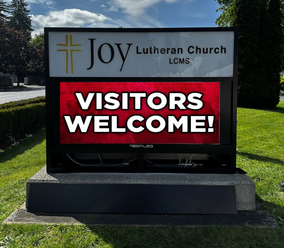
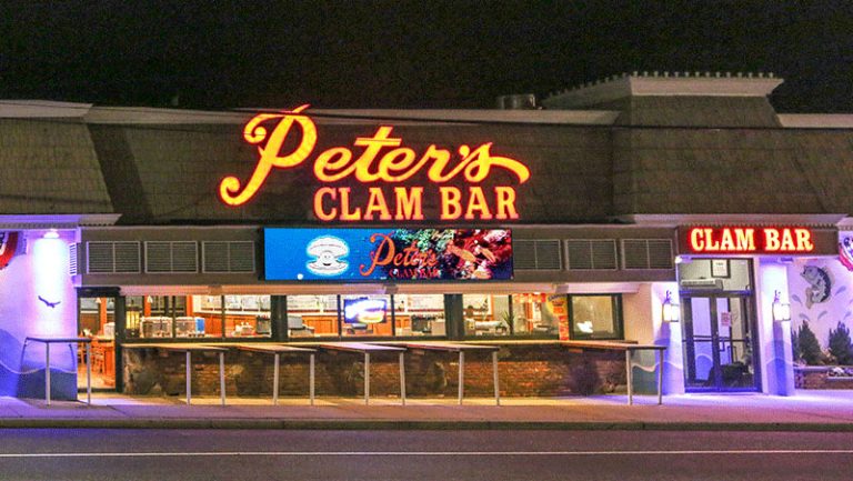
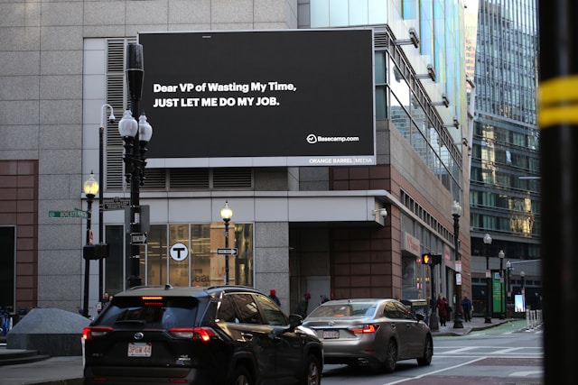




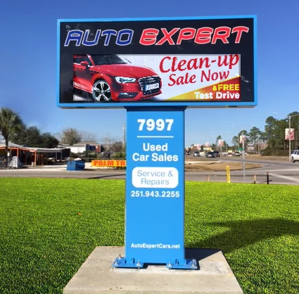

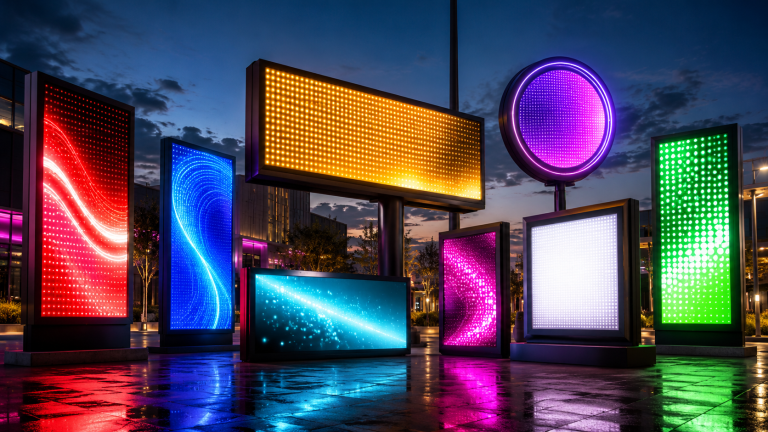

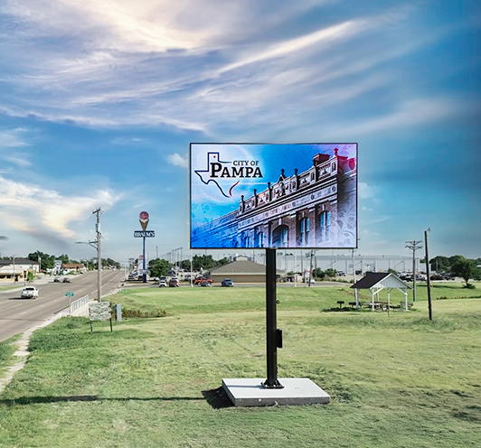


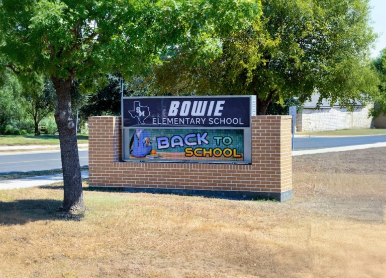
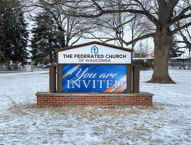


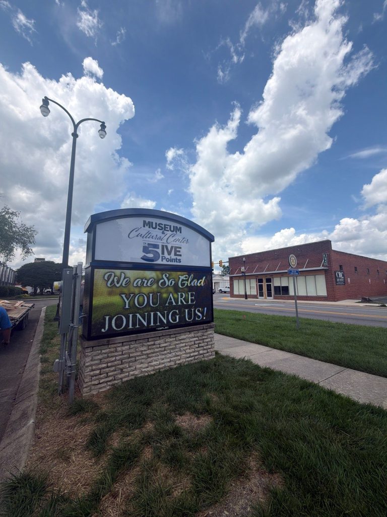
Alpha LED sign boards are great for anything from churches, to schools, to business. They tend to do great in large open spaces, where they are clearly visible.
Omega is our newest line of outdoor digital signs. Running the full gambit from cabinet, to LED sign, to logo on top, or any configuration of your choice!
Premier is a customizable Outdoor LED sign, perfect for the Entrepreneur who knows that large custom sized signs cultivated for their specific business is the way to go.
Programmable Stage LED signs, great for indoor assemblies, congregations, and presentations! Blow your competitors out of the water, or keep your congregation and audience glued to your message.