

What Is Smart Digital Signage? How Intelligent Screens Use Data, Software And Automation


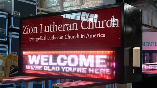
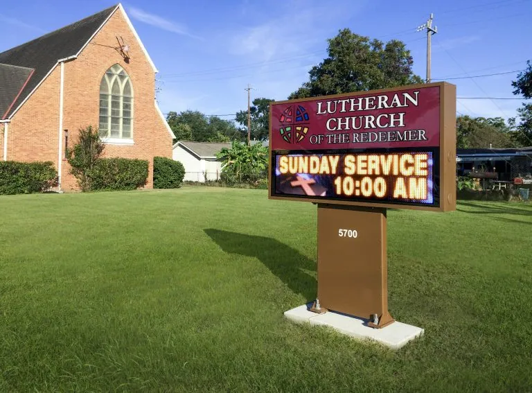
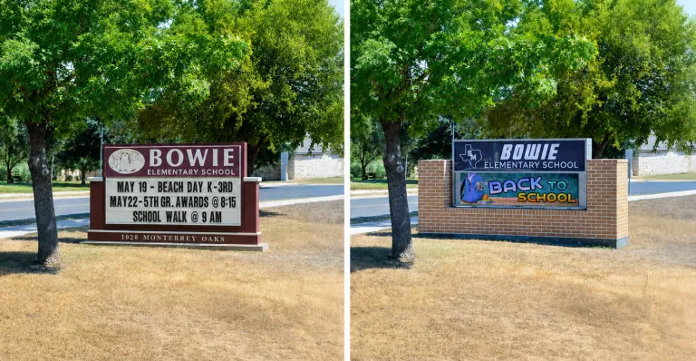
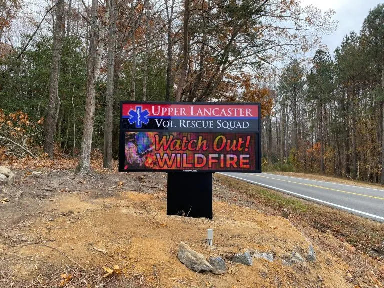
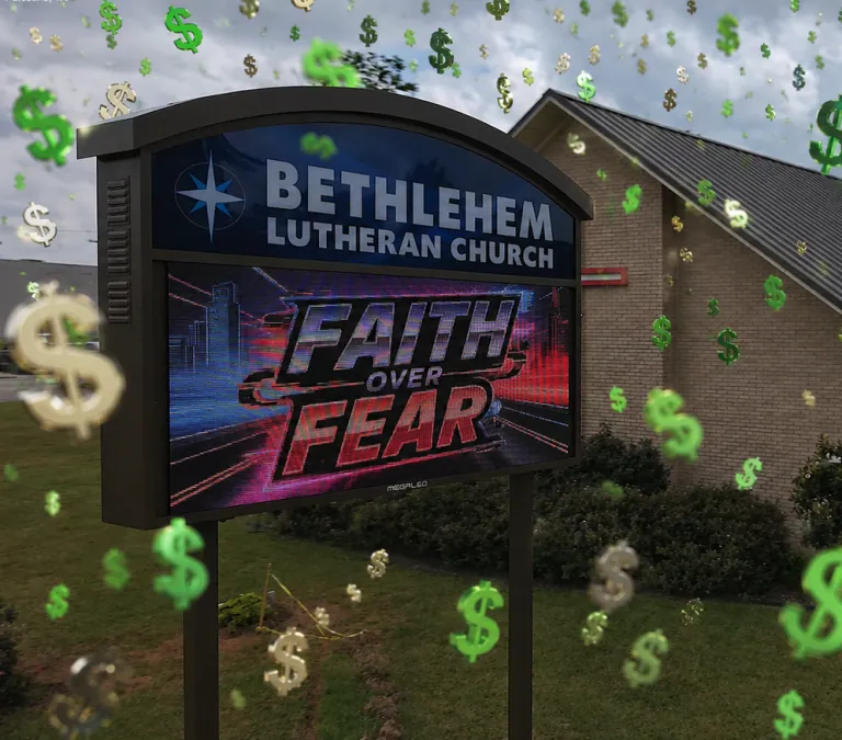
Alpha LED sign boards are great for anything from churches, to schools, to business. They tend to do great in large open spaces, where they are clearly visible.

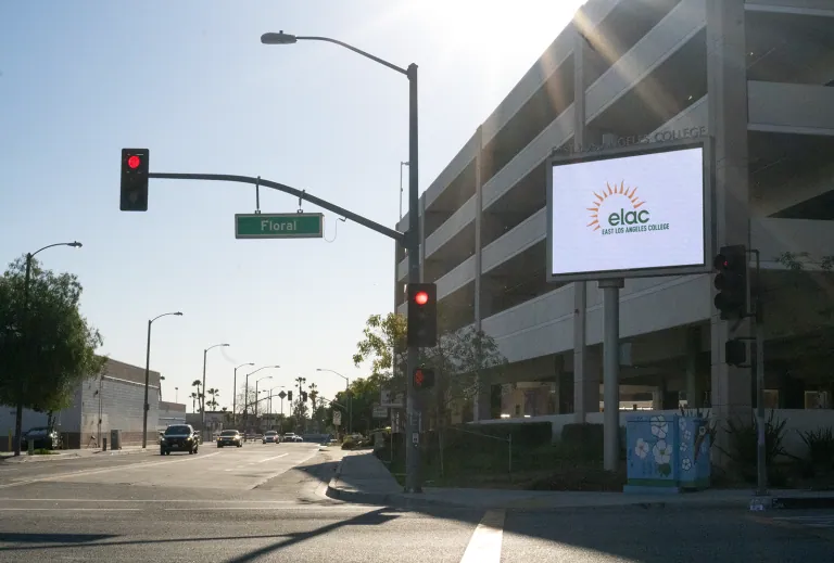
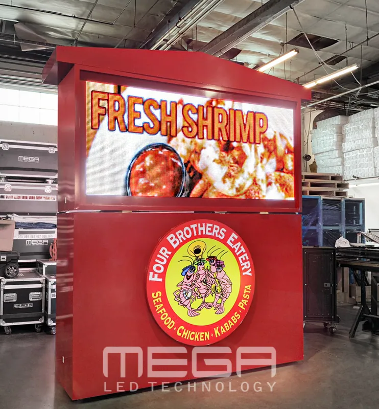
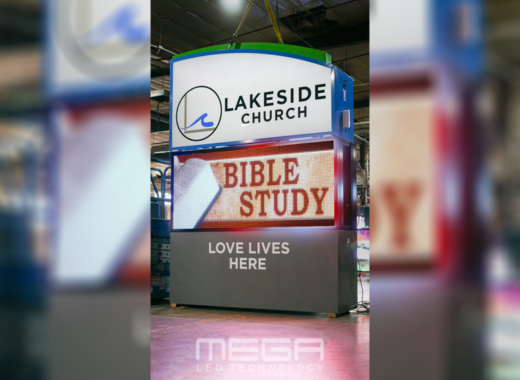
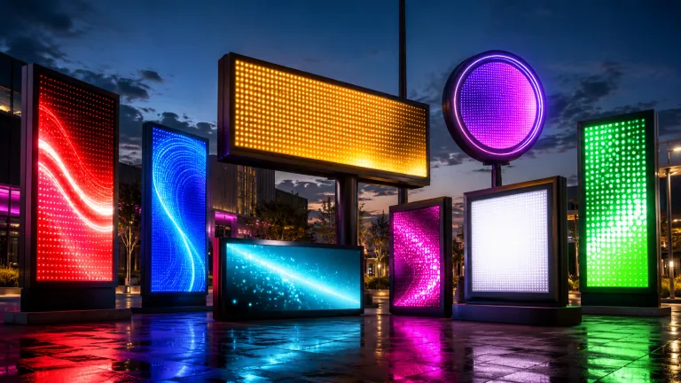
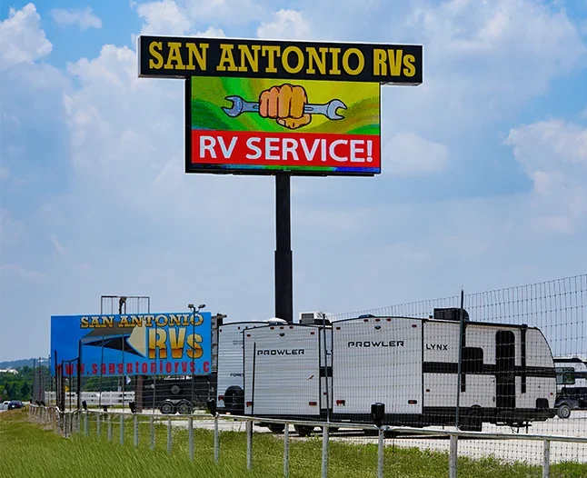
Omega is our newest line of outdoor digital signs. Running the full gambit from cabinet, to LED sign, to logo on top, or any configuration of your choice!

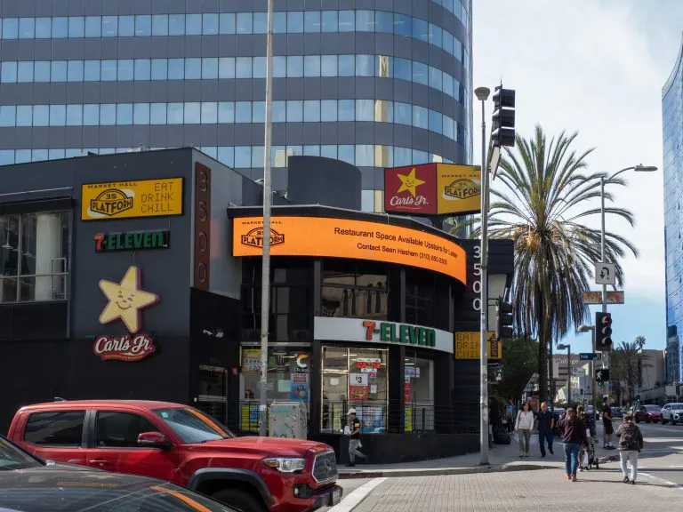
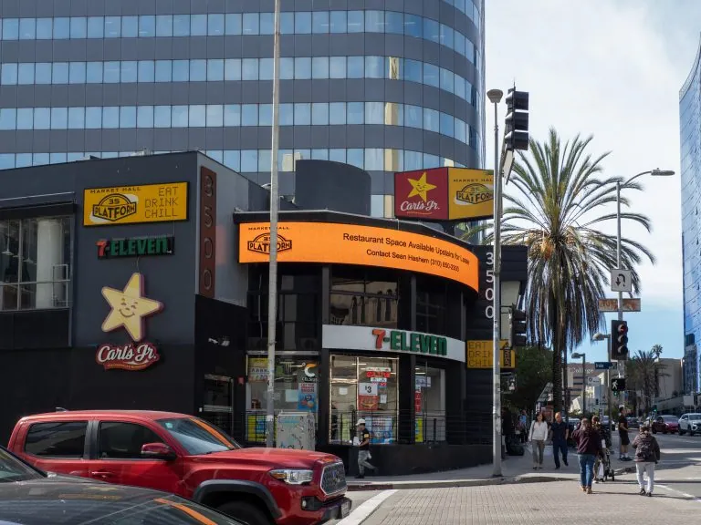
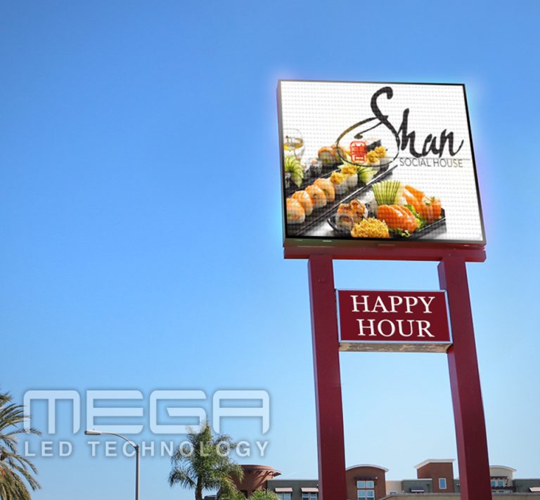
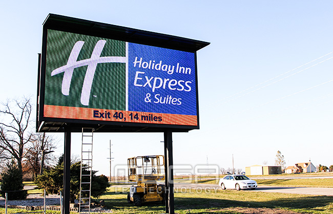
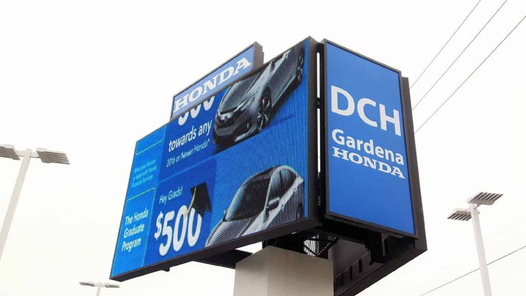
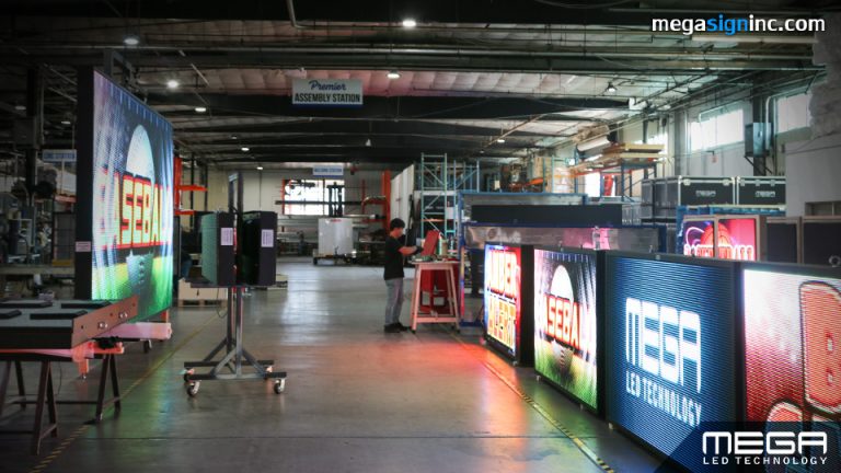
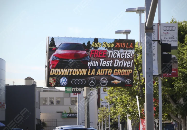
Premier is a customizable Outdoor LED sign, perfect for the Entrepreneur who knows that large custom sized signs cultivated for their specific business is the way to go.

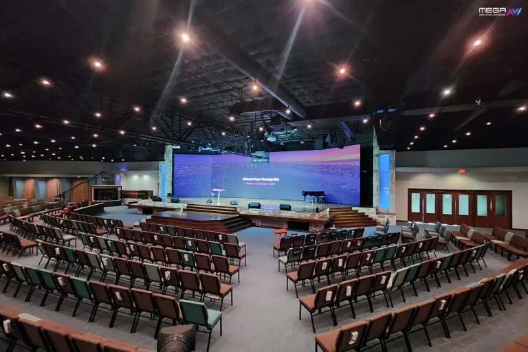
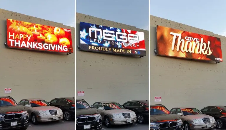
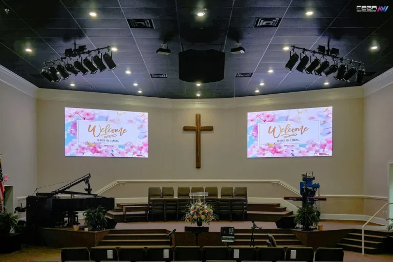
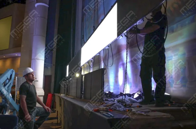
Programmable Stage LED signs, great for indoor assemblies, congregations, and presentations! Blow your competitors out of the water, or keep your congregation and audience glued to your message.

Alpha LED sign boards are great for anything from churches, to schools, to business. They tend to do great in large open spaces, where they are clearly visible.
Omega is our newest line of outdoor digital signs. Running the full gambit from cabinet, to LED sign, to logo on top, or any configuration of your choice!
Premier is a customizable Outdoor LED sign, perfect for the Entrepreneur who knows that large custom sized signs cultivated for their specific business is the way to go.
Programmable Stage LED signs, great for indoor assemblies, congregations, and presentations! Blow your competitors out of the water, or keep your congregation and audience glued to your message.
Alpha LED sign boards are great for anything from churches, to schools, to business. They tend to do great in large open spaces, where they are clearly visible.
Omega is our newest line of outdoor digital signs. Running the full gambit from cabinet, to LED sign, to logo on top, or any configuration of your choice!
Premier is a customizable Outdoor LED sign, perfect for the Entrepreneur who knows that large custom sized signs cultivated for their specific business is the way to go.
Programmable Stage LED signs, great for indoor assemblies, congregations, and presentations! Blow your competitors out of the water, or keep your congregation and audience glued to your message.
A sign gets a few seconds to earn a glance, and drivers won’t slow down to decode it. Get a design wrong and the message dies at the curb. Our guide walks you through readability, color, size, placement, and the mistakes that quietly waste signage budgets.
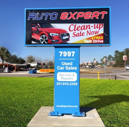
Successful signage starts with four decisions:
Nail those before touching fonts or colors, and the rest of the design tends to fall in place.
A good business sign is easy to read, memorable, and unmistakably yours. Those three tests cover the whole discipline, from a small storefront panel to a full digital display program.
This article covers how to design a sign step by step: readability, text length, layout, color, size, placement, audience, branding, formats, and materials. Treat this section as the starting point; what follows gets into the trade-offs and common mistakes we walk customers through every week.
Legibility decides whether your sign communicates or just decorates. People usually catch a sign in passing, on foot or from a car, so the message has to land in two to three seconds.
Four variables do the heavy lifting: font choice, text size, spacing, and contrast. A clean typeface at a generous size, with breathing room between letters and a strong light-dark color pairing, will outlive any decorative flourish. Script fonts and thin strokes tend to collapse at a distance.
Test readability the way viewers experience it: in motion, at an angle, and in poor light, where a design that reads on a monitor can vanish at 200 feet in glare. Simple typography wins in business signage because it survives those conditions.
Include only the words that carry the main message, which usually means a name, one supporting line, and one action. We’ve seen storefront signs try to carry a full menu of services, and every added line makes the important one harder to find.
Fewer words read faster, hold attention better, and scale bigger. A practical edit: write the sign copy, then remove anything that doesn’t support its single goal. If a detail matters but doesn’t fit, it belongs on your website or a window graphic, not on the primary sign.
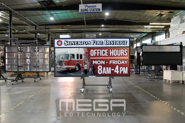
Layout determines how quickly a viewer understands the sign, because the eye follows a predictable path: biggest element first, then left to right, top to bottom. Put the payoff where that path begins.
Balance text and graphics by purpose. A wayfinding sign leans on one arrow and one word; a promotional sign can afford a photo and a price.
Leave open space around the message instead of filling every inch, since the empty area is what makes the message pop. A sign can be beautiful and still fail; it has to be beautiful and clear at the same time.
Color pulls three jobs at once: it makes the sign visible, it sets an emotional tone, and it ties the message to your brand. Start with visibility, since a sign nobody notices delivers nothing.
High contrast is non-negotiable at distance. Dark letters on a light field, or light on dark, hold up far better than tone-on-tone palettes that look refined up close and blur across a parking lot.
Color psychology earns its keep once contrast is settled: red reads urgent, blue reads steady, yellow grabs attention in cluttered settings. Pick pairings that satisfy both the brand book and the squint test from across the street.
Tell us about your location and goals, and our team will map out size, format, and budget options for you. The consultation and quote are free.
Size your sign from the viewer’s position, not from the mockup on your desk. Viewing distance, mounting height, traffic speed, and surrounding visual noise set the minimum, which is bigger than first-time buyers expect.
There’s a reason “go big or go home” became a signage cliche: on a busy corridor your sign competes with dozens of others, and scale wins the glance. The Federal Highway Administration’s Manual on Uniform Traffic Control Devices sets the national MUTCD sign standards, sizing roadway letters to travel speed because readability drops fast as speed climbs. The same physics applies to your storefront.
Bigger is not automatically better, though. Oversized signs with cramped text or poor placement broadcast confusion at a larger scale. Run the checklist below before locking dimensions.
| Checklist item | What to check | Working guideline |
|---|---|---|
| Letter height | Farthest point a viewer reads from | About 1 inch of letter height per 10 feet of reading distance |
| Contrast | Letter color against background in full sun | Strong light-dark pairing; avoid tone-on-tone schemes |
| Dwell time | Traffic speed past the location | Two to three seconds of reading favors seven words or fewer |
| Sightlines | Trees, poles, awnings, parked trucks | Walk and drive every approach before finalizing height |
| Brightness | Night output and local curfew rules | LED signs should dim after dark; many cities set limits |
| Code compliance | Local size, height, and setback limits | Confirm the permit envelope before designing to it |
Test the design in every condition it will actually face before approving production. Daylight, dusk, rain, backlighting from a low sun, and a crowded sidewalk each change what stays readable.
Walk the approaches and note angle, glare, shadows, obstructions. In our installations, the surprise is rarely the sign itself; it’s the oak tree that fills in by June or the delivery trucks that park in the sightline every morning.
Lighting solves half of these problems. Illuminated faces, reflective vinyl, and durable finishes that resist fading keep a sign working after sunset and after five summers. Confirm visibility before the design is final; it’s cheaper than re-fabricating.
Premier Series outdoor LED signs let you update your message from a phone in minutes. Custom sizes run from 1×3 feet up to full billboard scale.
Placement decides whether anyone notices, reads, and acts on the sign. The corner location with clear sightlines beats the prettier wall nobody faces.
Match the location to the sign’s job. A wayfinding sign belongs at the decision point, not after it.
Promotional signs belong where people pause: entrances, checkout lines, waiting areas. Roadside signs belong where drivers still have time to react before the turn.
Placement also has a legal layer. Cities regulate where signs can go, how high, and how bright, so confirm zoning before installation. We research permitting for our customers because a great sign in a prohibited spot helps no one.
Write the sign in your customer’s language, not your industry’s. A sign that says “orthodontic solutions” works harder as “straighter teeth, easier visits.”
Audience research sets tone, visuals, colors, and message style.
The U.S. Small Business Administration’s Marketing and Sales guide, part of its SBA business resources, opens the marketing plan with a target market description, and your signage should be built from the same profile.
Luxury shoppers respond to restraint; families respond to warmth and clarity; event visitors need fast orientation; office employees need consistency. Know who the sign is for, and the design choices start making themselves.
Your signage is your visual identity at architectural scale, so it should carry the same logo treatment, palette, typefaces, and voice as everything else you publish. A customer who sees your billboard, storefront, and lobby sign should never wonder whether they’re the same company.
Consistency compounds. Repeated exposure to the same marks across locations and campaigns is how strangers turn into people who recognize you. Build a simple signage style sheet: approved logo versions, color codes, minimum sizes, and clear-space rules, then hand it to every vendor who makes a sign for you.
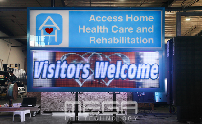
A sign can say quality, heritage, creativity, or trust before anyone reads a word. Brushed metal and deep tones read established; bright color on clean white reads modern; hand-lettered styles read craft.
Materials, typography, color, and imagery all carry meaning, and viewers absorb it in a glance. Keep the storytelling subtle: one clear personality signal beats a collage of clever references.
The test is simple. Line up every sign you display and ask whether they feel like one company telling one story. If not, decide which sign is telling the truth and align the rest.
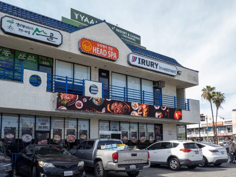
Pick the format first, because it drives every downstream choice: size, materials, layout, and budget. A promotional banner, a storefront sign, a sidewalk A-frame, and a digital screen are four different design problems.
Static formats reward permanence and simplicity; digital formats reward scheduling and change.
Grand View Research’s Digital Signage Market Size and Share Report estimates the digital signage market at USD 31.09 billion in 2025, with 8.2% projected annual growth through 2033, and the pull is practical: one display can carry every promotion you’ll run this year.
We build a wide range of signage to cover different marketing needs at competitive prices, from scrolling window units starting around $400 to Premier outdoor LED displays at billboard scale, with Alpha LED sign boards covering the storefront middle ground.
Alpha Series LED sign boards bring bright, programmable messaging to storefronts and roadside locations. Standard sizes keep pricing predictable.
Context should reshape the design every time. A retail storefront sign sells at a glance; an office lobby sign reassures; an event banner orients; a trade show backdrop stops foot traffic; a safety sign must be understood instantly.
Use case changes wording, materials, size, and the rules that apply.
Wayfinding and room signs in public buildings must meet federal accessibility criteria for character height, contrast, and tactile text, explained in the U.S. Access Board’s Chapter 7: Signs guide, part of its Access Board guidance.
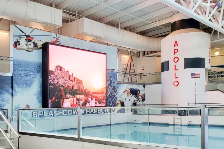
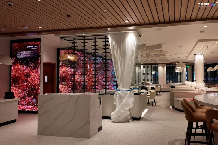
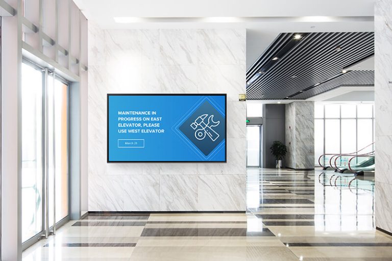
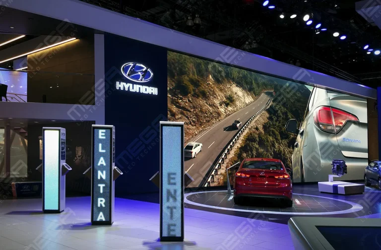
Indoors, the format question shifts from weather to impact: lobbies and retail interiors increasingly hang indoor video walls where a static panel once lived. Strong signage is designed around its context.
Materials decide how the sign looks on day one and on day one thousand. Cheap substrates fade, warp, and peel, and a peeling sign tells your customers a story you don’t want told.
Texture and finish shape perceived value: matte aluminum and dimensional letters read professional before anyone processes the words. As a veteran-owned manufacturer building LED signs in the USA, we’ve seen how construction details separate a ten-year sign from a two-year one, which is why our outdoor cabinets carry a LINE-X protective coating and our modules use gold-wire bonded LEDs that resist the uneven fading cheaper builds develop.
Confirm production requirements before finalizing art. Some materials limit color fidelity, minimum stroke widths, or panel sizes, and discovering that after approval costs real money.
Signage failures usually trace back to two habits: cramming in too much information and designing for a desk instead of the viewing conditions. Both are avoidable.
The repeat offenders:
Each format has its own trap. Yard signs get overloaded with phone numbers nobody can dial from a moving car. Promotional signs bury the offer under decoration.
Storefront signs chase style over legibility. Avoiding these mistakes costs nothing and makes every signage dollar work harder.
Configure a Premier Series outdoor LED sign for full creative and size control. https://www.megasigninc.com/premier-outdoor-led-signs/
An Alpha Series LED sign board covers storefront and roadside duty at a mid-range price. https://www.megasigninc.com/alpha-led-sign-boards/
A large indoor LED video wall turns the space itself into a sign. https://www.megasigninc.com/large-indoor-led-video-wall/
An Omega monument sign pairs a masonry-grade base with a programmable LED display. https://www.megasigninc.com/omega-monument-signs/
Start with one message, then make it readable at the real viewing distance. Choose a simple typeface, size the letters to roughly 1 inch per 10 feet of distance, and pair high-contrast colors.
Keep the word count low, arrange elements along a natural reading path, and match colors and fonts to your existing brand. Then test the design in daylight, at night, and from a moving car before production. A good sign is one a stranger understands in two to three seconds.
Too much text, weak contrast, and bad placement cause the bulk of signage failures. Small decorative fonts fail at distance, cluttered layouts hide the main message, and tone-on-tone color schemes vanish in sunlight.
Signs installed behind trees, above natural sightlines, or without the required permit lose their audience or come down entirely. Off-brand styling wastes recognition you’ve already paid to build. Before approving any design, check it against the viewing distance, the lighting conditions, and the local sign code.
Start with one message, then make it readable at the real viewing distance. Choose a simple typeface, size the letters to roughly 1 inch per 10 feet of distance, and pair high-contrast colors.
Keep the word count low, arrange elements along a natural reading path, and match colors and fonts to your existing brand. Then test the design in daylight, at night, and from a moving car before production. A good sign is one a stranger understands in two to three seconds.
Too much text, weak contrast, and bad placement cause the bulk of signage failures. Small decorative fonts fail at distance, cluttered layouts hide the main message, and tone-on-tone color schemes vanish in sunlight.
Signs installed behind trees, above natural sightlines, or without the required permit lose their audience or come down entirely. Off-brand styling wastes recognition you’ve already paid to build. Before approving any design, check it against the viewing distance, the lighting conditions, and the local sign code.

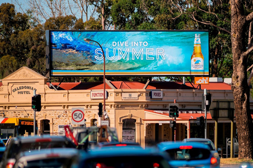


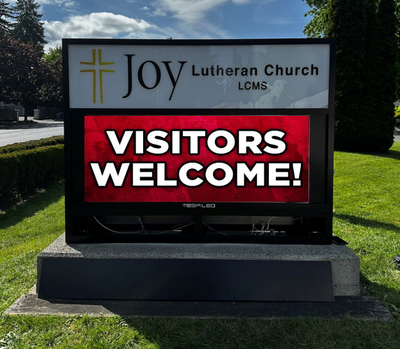




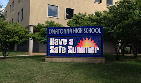






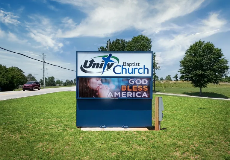






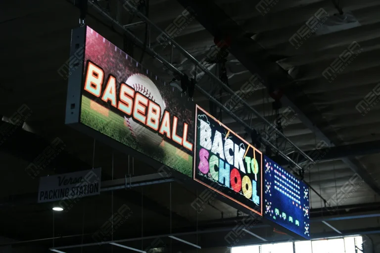




Alpha LED sign boards are great for anything from churches, to schools, to business. They tend to do great in large open spaces, where they are clearly visible.
Omega is our newest line of outdoor digital signs. Running the full gambit from cabinet, to LED sign, to logo on top, or any configuration of your choice!
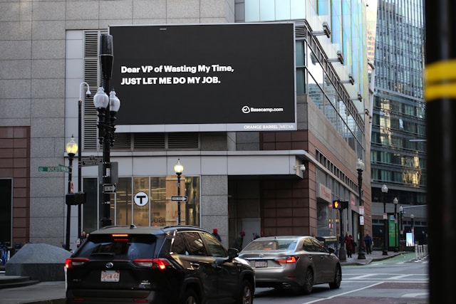
Premier is a customizable Outdoor LED sign, perfect for the Entrepreneur who knows that large custom sized signs cultivated for their specific business is the way to go.
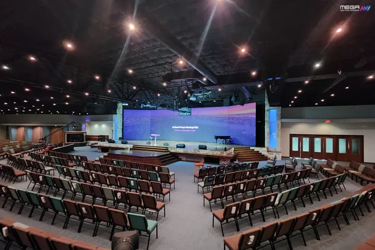
Programmable Stage LED signs, great for indoor assemblies, congregations, and presentations! Blow your competitors out of the water, or keep your congregation and audience glued to your message.