

What Is Smart Digital Signage? How Intelligent Screens Use Data, Software And Automation


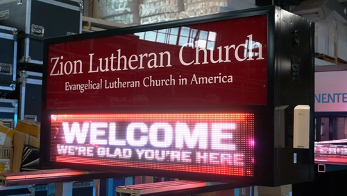
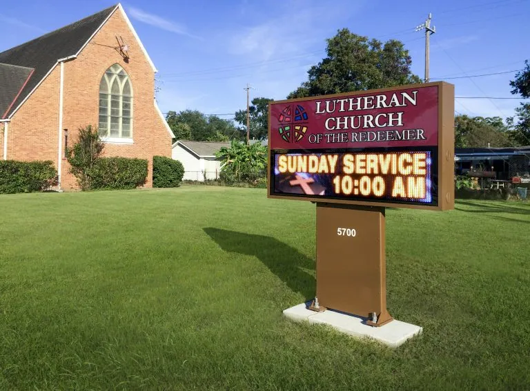
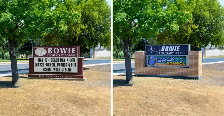
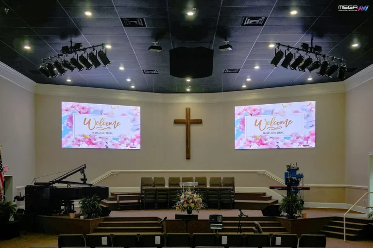
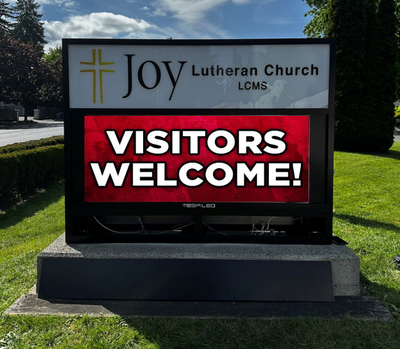
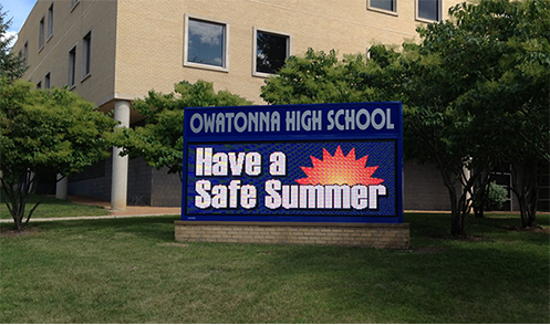
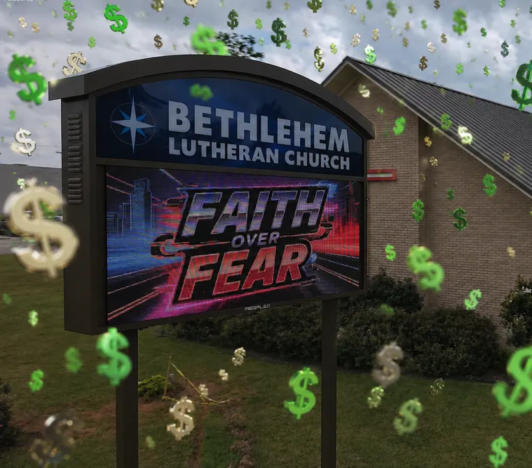
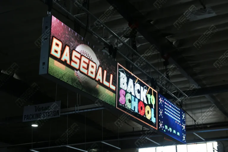
Alpha LED sign boards are great for anything from churches, to schools, to business. They tend to do great in large open spaces, where they are clearly visible.

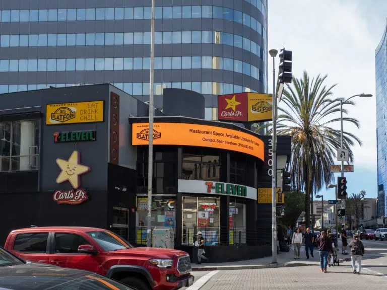
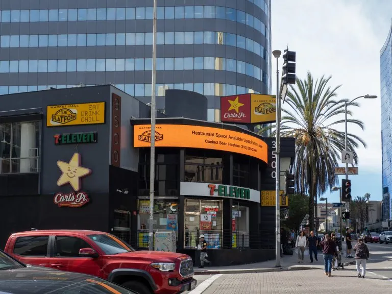
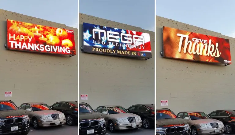
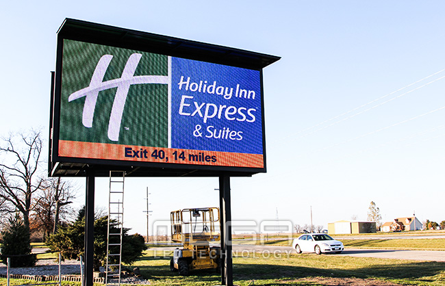
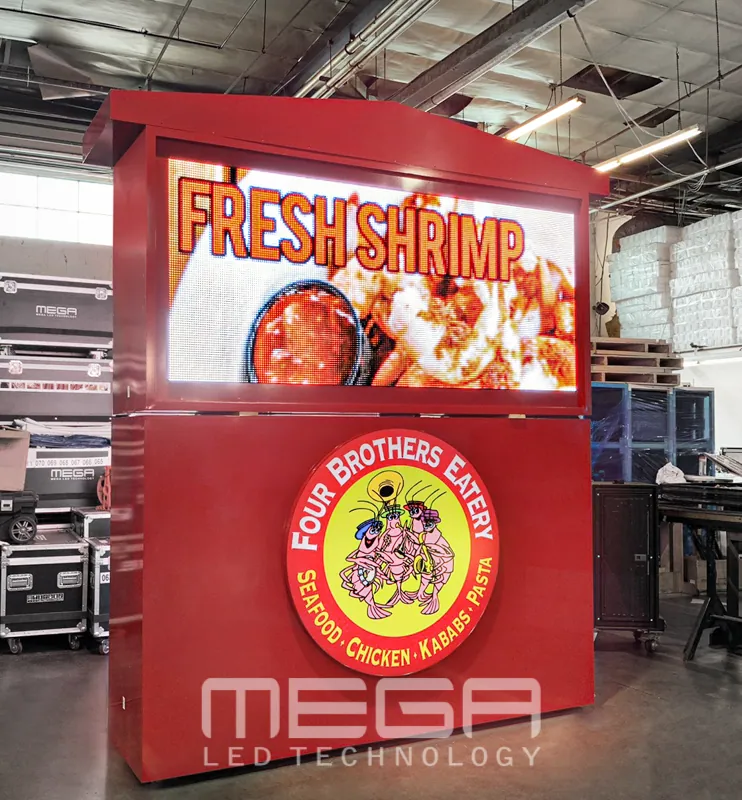
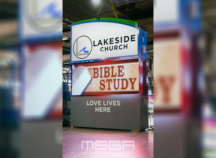
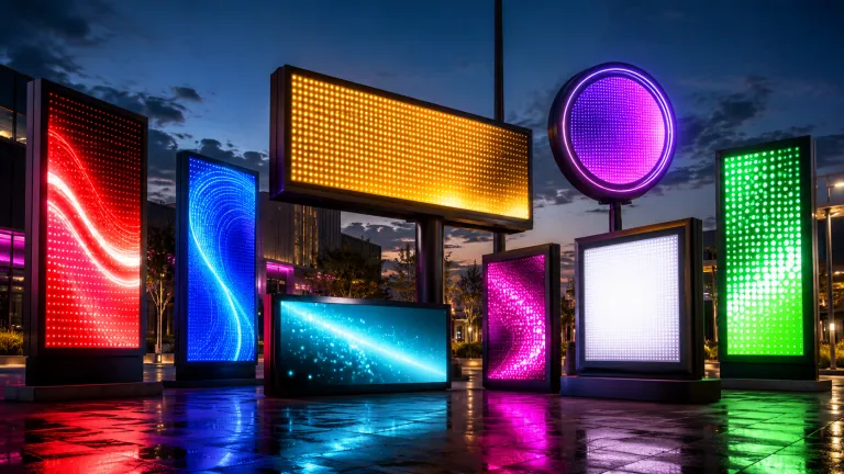
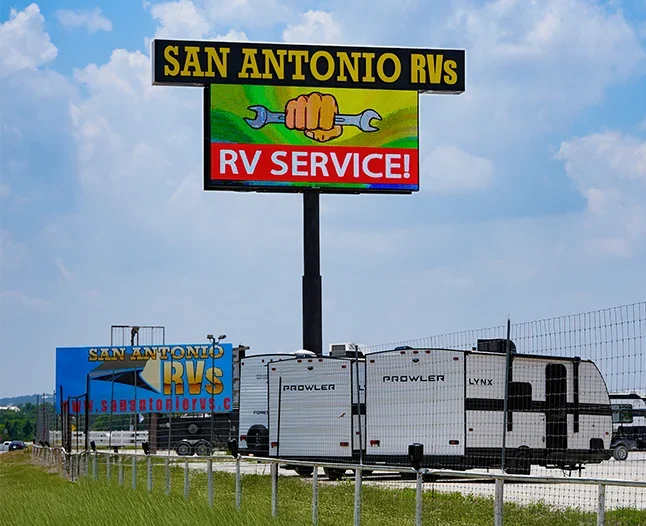
Omega is our newest line of outdoor digital signs. Running the full gambit from cabinet, to LED sign, to logo on top, or any configuration of your choice!

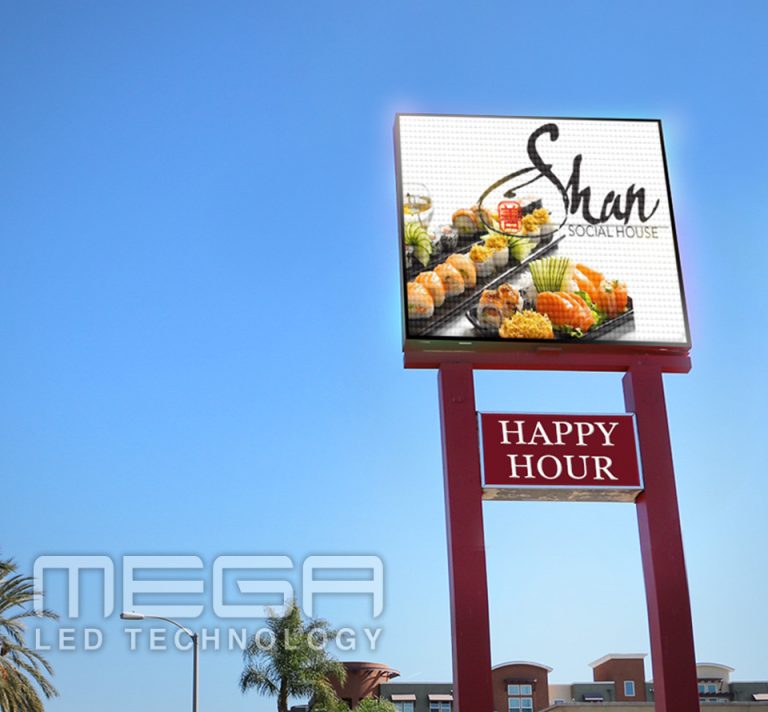
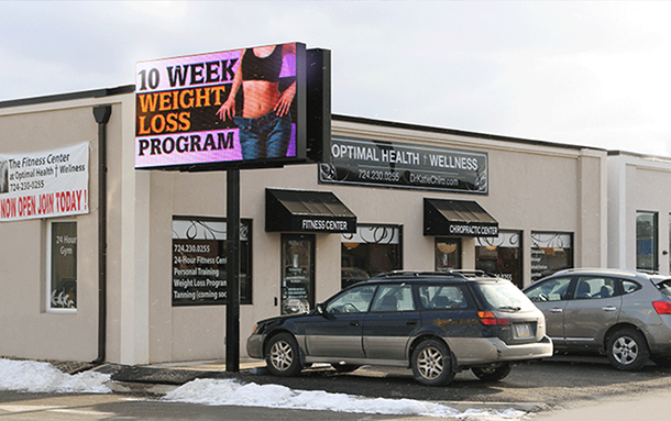
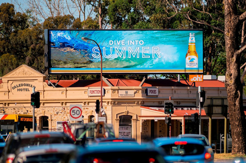
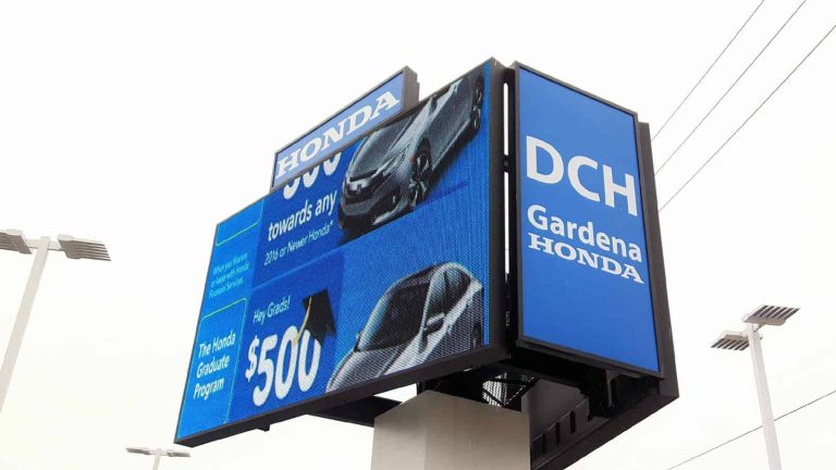
Premier is a customizable Outdoor LED sign, perfect for the Entrepreneur who knows that large custom sized signs cultivated for their specific business is the way to go.

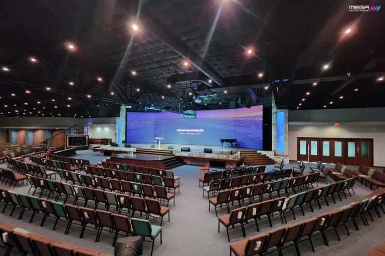
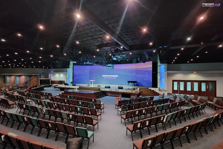
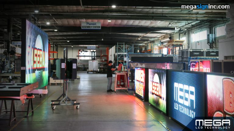
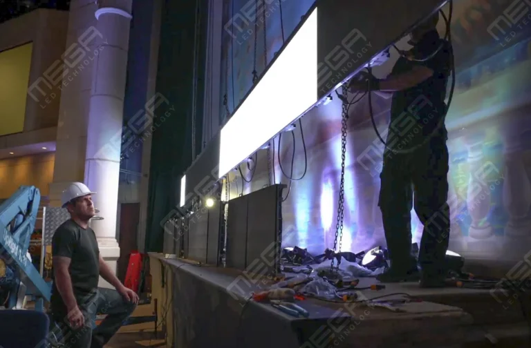
Programmable Stage LED signs, great for indoor assemblies, congregations, and presentations! Blow your competitors out of the water, or keep your congregation and audience glued to your message.

Alpha LED sign boards are great for anything from churches, to schools, to business. They tend to do great in large open spaces, where they are clearly visible.
Omega is our newest line of outdoor digital signs. Running the full gambit from cabinet, to LED sign, to logo on top, or any configuration of your choice!
Premier is a customizable Outdoor LED sign, perfect for the Entrepreneur who knows that large custom sized signs cultivated for their specific business is the way to go.
Programmable Stage LED signs, great for indoor assemblies, congregations, and presentations! Blow your competitors out of the water, or keep your congregation and audience glued to your message.
Alpha LED sign boards are great for anything from churches, to schools, to business. They tend to do great in large open spaces, where they are clearly visible.
Omega is our newest line of outdoor digital signs. Running the full gambit from cabinet, to LED sign, to logo on top, or any configuration of your choice!
Premier is a customizable Outdoor LED sign, perfect for the Entrepreneur who knows that large custom sized signs cultivated for their specific business is the way to go.
Programmable Stage LED signs, great for indoor assemblies, congregations, and presentations! Blow your competitors out of the water, or keep your congregation and audience glued to your message.
Most digital signage fails quietly. The screen works, the content plays, but nobody reads it. The gap between a screen that fills space and a screen that changes behavior comes down to a handful of practices. We cover all of them in this elaborate guide.

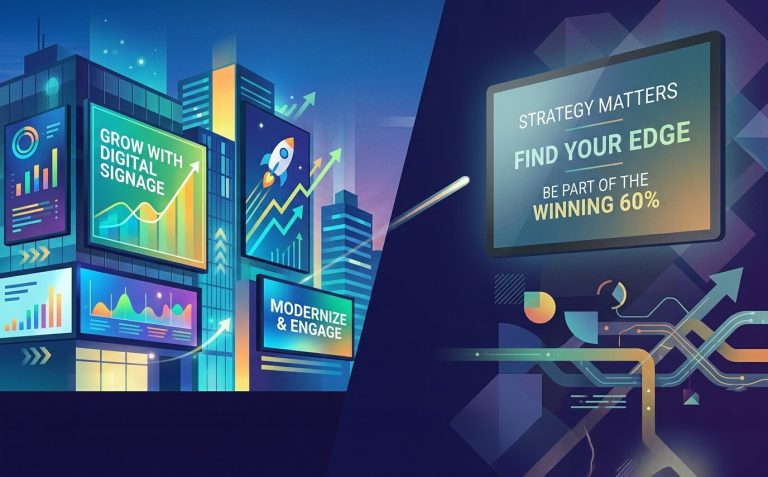
Strong digital signage starts with strategy, not screens. Buying a display before defining the goal, the audience, and the content plan is the single most common way businesses waste money on signage.
Best practices cover content, design, hardware, software, placement, analytics, and maintenance. The businesses that get results treat their screens as communication tools with clear objectives, not decoration that fills an empty wall.
Effective signage should be easy to read, visually engaging, brand-aligned, and measurable. If any of those four elements is missing, the screen underperforms. We cover each one in detail.
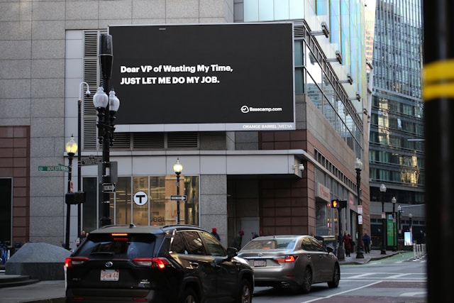
The message must be clear at a glance. A viewer passing a screen in a hallway, lobby, or storefront has three to five seconds to absorb the point.
Visibility, contrast, location, and relevance all contribute. Good signage removes friction by helping viewers quickly understand what matters. If someone has to stop, squint, or think about what the screen is saying, the design has failed.
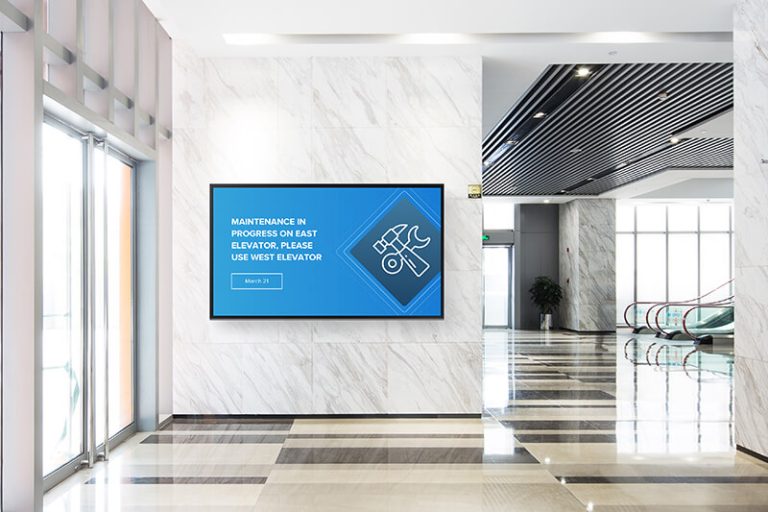
The screen’s physical environment matters too. A bright lobby with floor-to-ceiling windows needs a higher-brightness display than a dim corridor. Match the hardware to the space, not the other way around.

Every screen should have a defined purpose before content is created. According to Grand View Research’s digital signage market report, the global market was valued at $28.83 billion in 2024 and is projected to reach $45.94 billion by 2030. That growth is driven by businesses that treat screens as measurable tools, not passive displays.
Common goals include increasing sales, reducing perceived wait time, improving wayfinding, sharing safety updates, engaging employees, or promoting events. Each goal influences design choices, CTA style, screen placement, content duration, and measurement.
Match signage goals to specific KPIs. A retail screen promoting a sale should track conversion lift. An employee dashboard should track engagement or task completion. A wayfinding screen should reduce the number of visitors asking staff for directions. Without a KPI, you cannot tell whether the screen is working or just glowing.
Readability determines whether viewers can understand the message in the few seconds they spend looking. Unreadable text is the single most common digital signage mistake we see in the field.
Font size, font choice, spacing, line length, contrast, color, and viewing distance all affect readability. The industry standard is the 3×5 rule: use three lines of five words or five lines of three words. Total word count should stay under 40 words per screen. Anything beyond that and the viewer walks away before finishing.
Test screens from the actual viewing distance before launch. A design that looks clean on a laptop at two feet may be illegible on a 55-inch display from 20 feet. We’ve walked into businesses where the owner had no idea their screen was unreadable from the entrance because they only ever checked it from behind the counter.
Get a free consultation from our team. We help you choose the right display, resolution, and placement for your space and goals.
Distance, angle, lighting, and motion all affect legibility. Use large sans-serif fonts with strong spacing between letters and lines. Minimum 28-point headlines are a common standard for screens viewed from 10+ feet.
Keep important information out of tiny footnotes or crowded corners. Short lines, high contrast, and a strong text hierarchy (headline, subhead, body) help the eye find the message fast. We’ve seen lobbies where the screen looked perfect during installation but became unreadable once afternoon sunlight hit the glass. Test under real lighting conditions, not just ideal ones.
Layout controls where the eye goes first, second, and third. A clear visual hierarchy means the viewer reads the headline, absorbs the supporting detail, and sees the call to action in the right order without effort.
Spacing, content density, focal points, and grouping all contribute. The International Sign Association’s ISA industry data research confirms that the sign and visual communications industry generates over $37 billion annually in the U.S., which means best practices in layout are well-documented across thousands of deployments.
The strongest layouts simplify rather than overload. If a screen has three competing messages, the viewer reads none of them.
Use breathing room, simple backgrounds, and fewer competing elements. Each screen should have one dominant message or visual focus. A promotional slide with a headline, a single image, and a call to action outperforms a slide crammed with four offers, a logo, a QR code, and small print.
Over-cluttered backdrops reduce readability. If the background competes with the text, the text loses. When we audit a client’s existing signage, clutter is the problem in about half the screens we review. The fix is almost always subtraction, not addition.
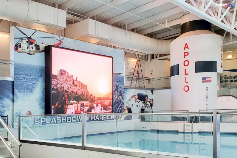
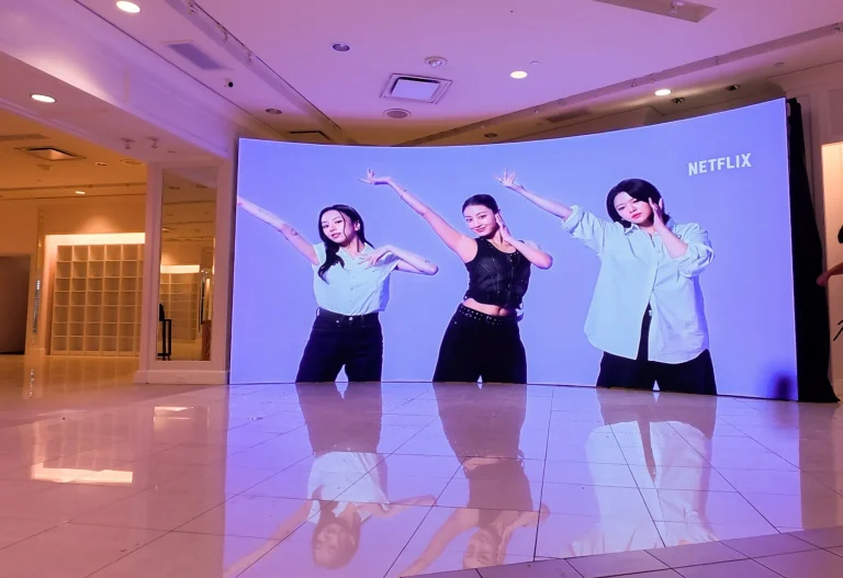
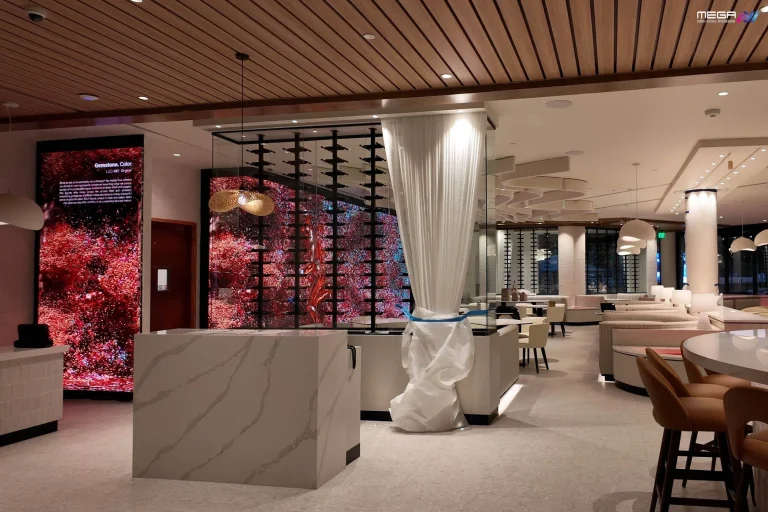
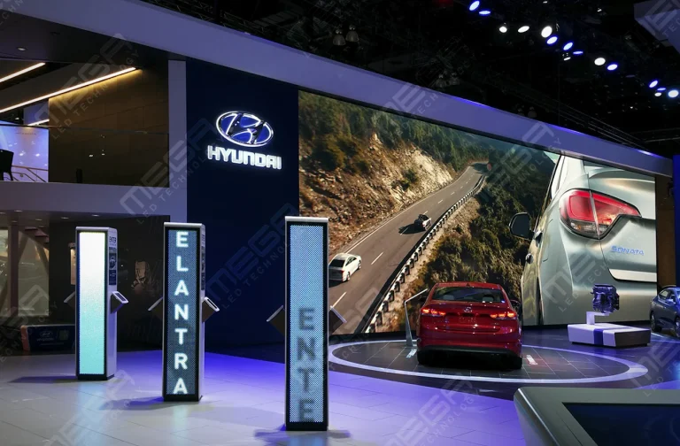
Our indoor video walls deliver bright, seamless visuals for corporate lobbies, retail spaces, stages, and worship environments.
Visual impact comes from strong imagery, clean design, and purposeful movement. The Outdoor Advertising Association of America and Morning Consult’s OOH retail research found that 42% of consumers say out-of-home displays directly affect their in-store decisions. That influence depends on image quality and design clarity.
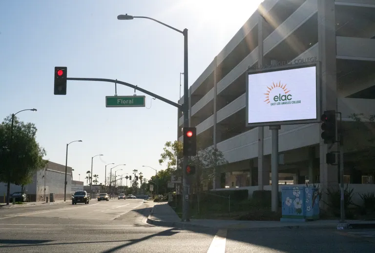
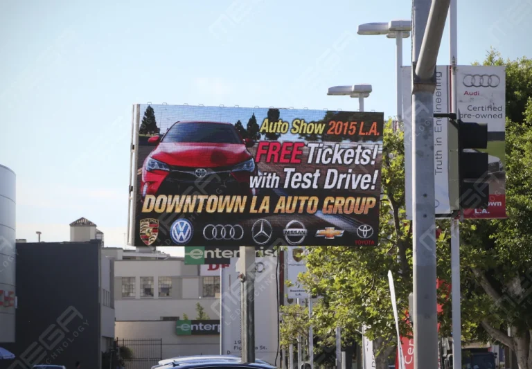
Use high-resolution images, sharp graphics, and professionally prepared assets. Low graphic quality makes a brand look cheap and tells the viewer you cut corners. Movement should attract attention, not overwhelm the message. A subtle animation that guides the eye to a headline works. A screen full of flashing elements does not. For outdoor displays, brightness matters as much as resolution. A screen that washes out in direct sunlight loses all visual impact regardless of how good the content looks indoors.

Images and graphics work well for promotions, menus, brand storytelling, and wayfinding. Video is useful for product demos, event recaps, and ambiance but should be short, relevant, and readable without sound.
If the screen is in a noisy environment, assume the viewer cannot hear audio. Add captions or let the visuals carry the story on their own. Keep video clips under 15 seconds for screens in high-traffic areas where people are walking past, and under 60 seconds for waiting areas where the audience has time to watch.
Signage should feel like part of the brand, not a random screen bolted to the wall. Brand colors, typography, logos, tone, imagery, and layout standards should carry through every display.
Inconsistent branding weakens recognition and trust. If one screen uses the brand palette and another uses stock templates, visitors notice the mismatch. Standardize templates and approval rules so every screen stays on brand.
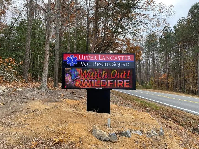
Our Premier outdoor signs are built in the USA with IP67-rated modules, LINE-X coated cabinets, and a 5-year warranty.
We’ve found that a quick consultation at the design stage prevents brand drift across locations. Our team can help buyers choose indoor video walls or Premier outdoor LED displays that match the brightness, color accuracy, and viewing angle their brand standards require.
Logos should support brand recognition without overpowering the message. Consistent placement, sizing, and spacing across every screen builds familiarity without distraction.
Brand standards should guide every display, especially across teams or locations. A franchise with 20 locations running 20 different screen designs loses the cohesion that makes branding work. Create a simple style guide that specifies logo position, minimum clear space, approved colors, and font hierarchy so every team member producing content for screens follows the same rules.
Outdated screens quickly lose attention and credibility. A screen still showing last month’s promotion tells the viewer that nobody is managing the content, which undermines trust in everything else the screen says.
Dynamic content, real-time updates, content rotation, social media feeds, and live data dashboards all keep screens active. Neglected updates are one of the most common reasons signage fails. Create a refresh schedule (weekly at minimum) and assign one person to own it. The screens don’t maintain themselves.
Weather, news, social media feeds, inventory levels, wait times, event schedules, and sales dashboards all qualify as real-time content. Data-driven content improves engagement and reduces manual update work.
Real-time content should be accurate, reliable, and relevant. A weather widget that displays the wrong city or a social feed pulling irrelevant posts does more harm than good. Test integrations before launch and build in fallback content for when a data feed goes offline. A blank widget on a live screen looks worse than a static slide.

AI can help generate content ideas, automate updates, personalize messaging, and organize workflows. It works for promotions, internal updates, menu changes, event reminders, and data-driven messages that would take staff hours to manage manually.
AI-assisted signage should still follow brand standards and approval rules. Automation works when paired with human oversight. A system that publishes content without review can push errors to a screen that hundreds of people see every hour. The safest approach is AI-assisted drafting with human approval before anything goes live.
Signage could respond to weather, inventory levels, foot traffic, time of day, or business data. Imagine a restaurant screen that switches from the breakfast to the lunch menu at 11 a.m. and highlights low-stock specials before closing.
Connected systems (sometimes called MCP-style workflows) allow screens to pull data from multiple sources and display the right message at the right moment. A church could auto-schedule holiday messages weeks ahead. A retailer could surface clearance items when inventory hits a threshold. Automation should improve relevance, not create random content.
Bad signage is unclear, unreadable, poorly placed, outdated, cluttered, or simply irrelevant to the audience. Treating a digital screen like a static print poster is the most common root cause we see. A printed flyer designed for arm’s length does not work on a 55-inch screen viewed from 15 feet.
Common mistakes include using too much text, ignoring placement, running inconsistent branding, failing to monitor playback, and never updating content. Mistakes hurt credibility and waste the investment.
Audit screens regularly. Walk the space, check every display, and ask: is this screen still doing what it was supposed to do? Schedule a quarterly walkthrough at minimum. Seasonal promotions expire, staff changes happen, and content that made sense six months ago may now be irrelevant or embarrassing.
| Best Practice | What It Looks Like | Common Mistake |
|---|---|---|
| Define the goal first | One clear KPI per screen | Buying hardware before defining purpose |
| Design for 3 to 5 seconds | Short text, high contrast, one message | Cramming multiple offers onto one slide |
| Match brand identity | Consistent colors, fonts, templates | Mixing stock templates across locations |
| Update content regularly | Weekly refresh schedule with assigned owner | Running the same content for months |
| Test from viewing distance | Check readability from 10 to 20+ feet | Designing at laptop distance only |
Our indoor LED video walls deliver seamless, high-resolution visuals for immersive indoor environments. https://www.megasigninc.com/large-indoor-led-video-wall/
An Alpha LED sign board gives you a clean, bright display in a mid-size format with easy content updates. https://www.megasigninc.com/alpha-led-sign-boards/
Our Premier outdoor LED signs are built with IP67-rated modules and LINE-X coated cabinets for maximum outdoor durability. https://www.megasigninc.com/premier-outdoor-led-signs/
Contact our team for a free consultation. We will review your space, goals, and budget to recommend the right display. https://www.megasigninc.com/contact/
Start with a clear goal, design for readability, and keep content fresh. Every screen should have one defined purpose, whether that is driving sales, guiding visitors, or engaging employees. Use short text (under 40 words), high-contrast colors, and large fonts so the message is readable in three to five seconds. Match every display to the brand’s visual identity and update content on a regular schedule. Audit screens periodically by checking them from the viewer’s real distance and angle.
Use large sans-serif fonts, high contrast, and the 3×5 text rule. Readability depends on font size, spacing, contrast, and viewing distance. The 3×5 rule means three lines of five words or five lines of three words per screen. Test every screen from the actual viewing distance before launch, not from a laptop at two feet. Avoid cluttered backgrounds, small footnotes, and low-contrast color combinations that make text difficult to read in real lighting conditions.
Start with a clear goal, design for readability, and keep content fresh. Every screen should have one defined purpose, whether that is driving sales, guiding visitors, or engaging employees. Use short text (under 40 words), high-contrast colors, and large fonts so the message is readable in three to five seconds. Match every display to the brand’s visual identity and update content on a regular schedule. Audit screens periodically by checking them from the viewer’s real distance and angle.
Use large sans-serif fonts, high contrast, and the 3×5 text rule. Readability depends on font size, spacing, contrast, and viewing distance. The 3×5 rule means three lines of five words or five lines of three words per screen. Test every screen from the actual viewing distance before launch, not from a laptop at two feet. Avoid cluttered backgrounds, small footnotes, and low-contrast color combinations that make text difficult to read in real lighting conditions.








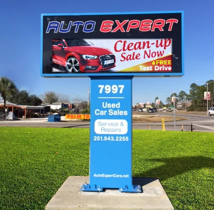















Alpha LED sign boards are great for anything from churches, to schools, to business. They tend to do great in large open spaces, where they are clearly visible.
Omega is our newest line of outdoor digital signs. Running the full gambit from cabinet, to LED sign, to logo on top, or any configuration of your choice!
Premier is a customizable Outdoor LED sign, perfect for the Entrepreneur who knows that large custom sized signs cultivated for their specific business is the way to go.
Programmable Stage LED signs, great for indoor assemblies, congregations, and presentations! Blow your competitors out of the water, or keep your congregation and audience glued to your message.